4 Multivariate analysis: Clustering and Ordination
Imagine you are a public health researcher and you wish to determine how the health of individuals in a population is related to their living and working conditions, and access to health services. You will, of course, have to define health in terms of factors that can be measured for each individual such as: body mass index, mobility, sick days per year, blood pressure, self-reported well-being on a scale of 1 to 5, and so on. One could create a single synthetic “health” metric to which standard univariate approaches, such as multiple linear regression, could be applied. However, it is certainly plausible that different components of this metric could be related to different aspects of the potential predictors. In addition, some of the components of health may not not responsive to the potential predictors. It may be better to explore how all the different indicator and predictor variables are related.
Similarly, we may wish to understand how precipitation, fertilization application rates, slope, soil composition and compaction are related to plant community composition. In this question, we may be tracking the abundance of over a dozen different species and many different sites with different types of soil, precipitation and other environmental factors. Again, we could possibly convert this multiplicity of information so that we have a single metric to describe the plant community (e.g., biodiversity), but such conversion may obscure important differences between species. Again, you can easily see that this is not a situation that ordinary univariate approaches are designed to handle!
In this module we’ll be discussing multivariate quantitative methods. Analyses such as linear regression, where we relate a response, y, to a predictor variable, x, are univariate techniques. If we have multiple responses, \(y_1...y_n\), and multiple predictors, \(x_1...x_n\), we need multivariate approaches. There are many types of multivariate analysis, and we will only describe some of the most common ones. We can think of these different types of analysis as laying at different ends of a spectrum of treating the data as discrete vs continuous, and relying on identifying a reponse variable a priori versus letting the “data tell us” about explanatory features, i.e., latent variables (Fig. 4.1).
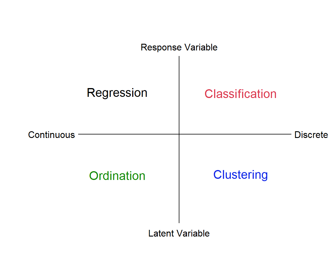
Figure 4.1: Types of multivariate analysis
4.1 Multivariate resemblance
The starting point for a lot of the classic multivariate methods is to find metrics that describe how similar two individuals, samples, sites or species might be. A natural way to quantify similarity is to list those characters that are shared. For example, what genetic or morphological features are the same or different between two species? A resemblance measure quantifies similarity by adding up in some way the similarities and differences between two things. We can express the shared characters of objects as either: similarity (S), which quantifies the degree of resemblance or dissimilarity (D), which quantifies the degree of difference.
4.1.1 Binary Similarity metrics
The simplest similarity metric just tallys the number of shared features. This is called a binary similarity metric, since we are just indicating a yes or no for each characteristic of the two things we wish to compare (Table 4.1).
| Attribute | Object 1 | Object 2 | Similar |
|---|---|---|---|
| Attribute 1 | 1 | 0 | no |
| Attribute 2 | 0 | 1 | no |
| Attribute 3 | 0 | 0 | yes |
| Attribute 4 | 1 | 1 | yes |
| Attribute 5 | 1 | 1 | yes |
| Attribute 6 | 0 | 0 | yes |
| Attribute 7 | 0 | 1 | no |
| Attribute 8 | 0 | 0 | yes |
| Attribute 9 | 1 | 1 | yes |
| Attribute 10 | 1 | 0 | no |
We could also use a shared lack of features as an indicator of similarity. The simple matching coefficient uses both shared features, and shared absent features, to quantify similarity as \(S_m=\frac{a+d}{a+b+c+d}\), where a refers to the number of shared characteristics of object 1 and object 2, b is the number characteristics that object 1 possesses but object 2 does not and so on (see Table 4.2).
| Present | Absent | ||
|---|---|---|---|
| Object 1 | Present | a | b |
| Object 2 | Absent | c | d |
We can further categorize similarity metrics as symmetric, where we regard both shared presence and shared absence as evidence of similarity, the simple matching coefficient, \(S_m\) would be an example of this, or asymmetric, where we regard only shared presence as evidence of similarity (that is, we ignore shared absences). For example, asymmetric measures are most useful in analyzing ecological community data, since it is unlikely to be informative that two temperature zone communities lack tropical data, or that aquatic environments lack terrestrial species.
The Jaccard index is an asymmetric binary similarity coefficient calculated as \(S_J=\frac{a}{a+b+c}\), while the quite similar Sørenson index is given as \(S_S=\frac{2a}{2a+b+c}\), and so gives greater weight to shared similarities. Both metrics range from 0 to 1, where a value of 1 indicates complete similarity. Notice that both metrics exclude cell \(d\) - the shared absences.
Let’s try an example. In the 70s, Watson & Carpenter (1974) compared the zooplankton species present in Lake Erie and Lake Ontario. We can use this information to compare how similar the communities in the two lakes were at this time. We can see that they shared a lot of species (Table 4.3)!
| species | erie | ontario |
|---|---|---|
| 1 | 1 | 1 |
| 2 | 1 | 1 |
| 3 | 1 | 1 |
| 4 | 1 | 1 |
| 5 | 1 | 1 |
| 6 | 1 | 1 |
| 7 | 1 | 1 |
| 8 | 1 | 1 |
| 9 | 1 | 1 |
| 10 | 1 | 1 |
| 11 | 1 | 1 |
| 12 | 1 | 1 |
| 13 | 1 | 1 |
| 14 | 1 | 1 |
| 15 | 1 | 1 |
| 16 | 1 | 1 |
| 17 | 1 | 1 |
| 18 | 1 | 1 |
| 19 | 1 | 0 |
| 20 | 0 | 1 |
| 21 | 0 | 0 |
| 22 | 0 | 0 |
| 23 | 0 | 0 |
| 24 | 0 | 0 |
We can calculate the similarity metrics quite easily using the table() function, where 1 indicates presence and 0 indicates absence. I have stored the information from Table 4.3 in the the dataframe lksp. I’m just going grab the presences and absences, since I don’t need the species identifiers for my calculation.
tlake = table(lksp[, c("erie", "ontario")])
tlake
ontario
erie 1 0
1 18 1
0 1 4a = tlake[1, 1]
b = tlake[1, 2]
c = tlake[2, 1]
d = tlake[2, 2]
S_j = a/(a + b + c)
S_j[1] 0.9S_s = 2 * a/(2 * a + b + c)
S_s[1] 0.9473684A final note: when a dissimilarity or similarity metric has a finite range, we can simply convert from one to the other. For example, for similarities that range from 1 (identical) to 0 (completely different), dissimilarity would simply be 1-similarity.
4.1.2 Quantitative similarity & dissimilarity metrics
While binary similarity metrics are easy to understand, there are a few problems. These metrics work best when we have a small number of characteristics and we have sampled very well (e.g., the zooplankton in Lake Erie and Ontario). However, these metrics are biased against maximum similarity values when we have lots of characteristics (or species) and poor sampling.
In addition, we sometimes have more information than just a “yes” or “no” which we could use to further characterize similarity. Quantitative similarity and dissimilarity metrics make use of this information. Some examples of quantitative similarity metrics are: Percentage similarity (Renkonen index), Morisita’s index of similarity (not dispersion) and Horn’s index. However, quantitative dissimilarity metrics are perhaps more commonly used. In this case, we often talk about the “distance” between two things. Distances are of two types, either dissimilarity, converted from analogous similarity indices, or specific distance measures, such as Euclidean distance, which doesn’t have a counterpart in any similarity index. There are many, many such metrics, and obviously, you should choose the most accurate and meaningful distance measure for a given application. Legendre & Legendre (2012) offer a key on how to select an appropriate measure for given data and problem (check their Tables 7.4-7.6). If you are uncertain, then choose several distance measures and compare the results.
4.1.2.1 Euclidean Distance
Perhaps the mostly commonly used, and easiest to understand distance measure is Euclidean distance. This metric is zero for identical sampling units and has no fixed upper bound.
Euclidean distance in multivariate space is derived from our understanding of distance in a Cartesian plane. If we had two species abundances measured in two different samples, we could then plot the abundance of species 1 and species 2 for each sample on a 2D plane, and draw a line between them. This would be our Euclidean distance: the shortest path between the two points (Fig. 4.2).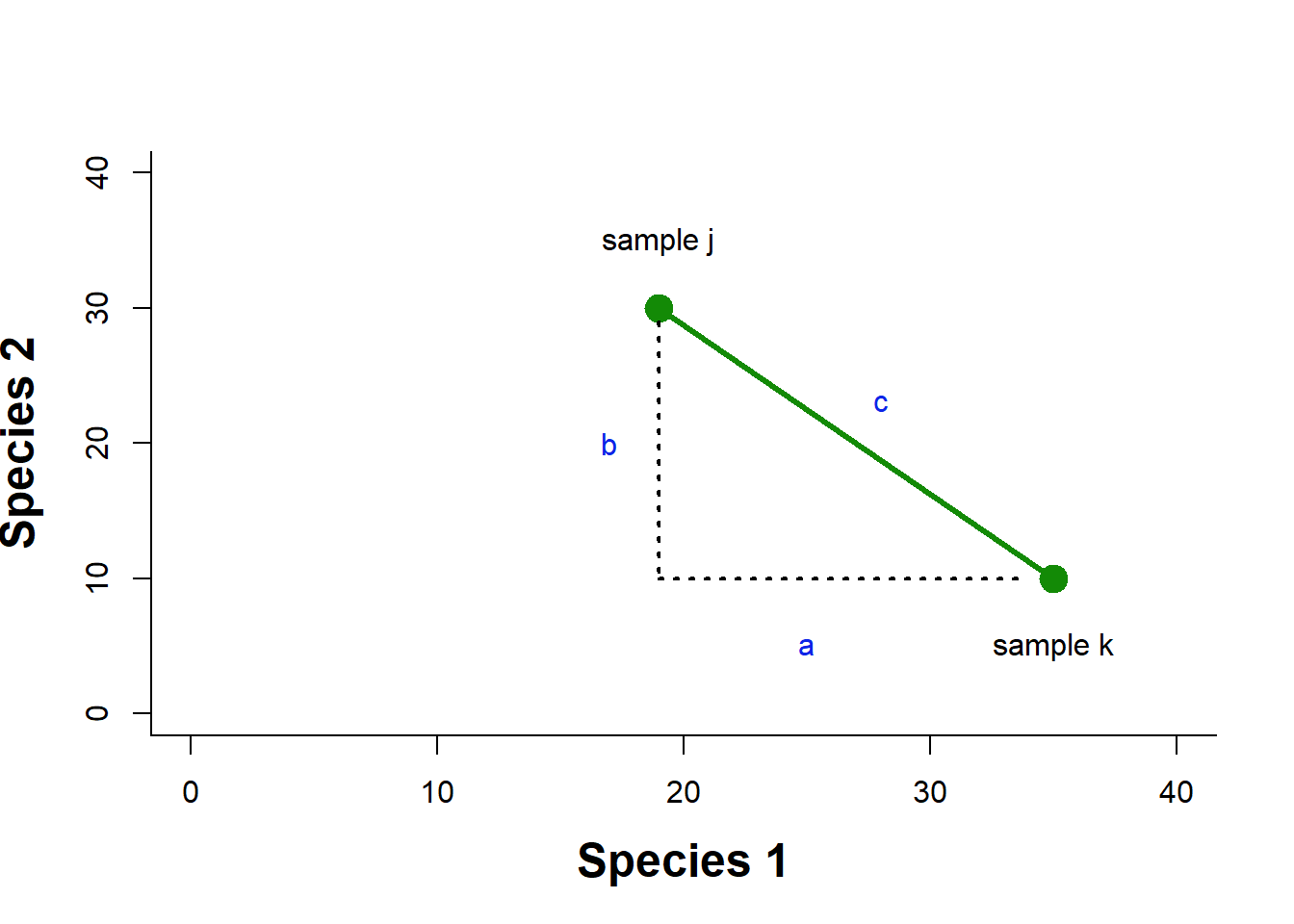
Figure 4.2: Example of a Euclidean distance calculation in a two dimensional space of species abundance
We know that to calculate this distance we would just use the Pythagorean theorem as \(c=\sqrt{a^2+b^2}\). To generalize to \(n\) species we can say \(D^E_{jk}=\sqrt{\sum^n_{i=1}(X_{ij}-X_{ik})^2}\), where Euclidean distance between samples j and k, \(D^E_{jk}\), is calculated by summing over the distance in abundance of each of n species in the two samples.
Let’s try an example. Given the species abundances in Table 4.4, we can calculate the squared difference in abundance for each species, and sum that quantity.
| sample j | sample k | \((X_j-X_k)^2\) | |
|---|---|---|---|
| Species 1 | 19 | 35 | 256 |
| Species 2 | 35 | 10 | 625 |
| Species 3 | 0 | 0 | 0 |
| Species 4 | 35 | 5 | 900 |
| Species 5 | 10 | 50 | 1600 |
| Species 6 | 0 | 0 | 0 |
| Species 7 | 0 | 3 | 9 |
| Species 8 | 0 | 0 | 0 |
| Species 9 | 30 | 10 | 400 |
| Species 10 | 2 | 0 | 4 |
| TOTAL | 131 | 113 | 3794 |
Exercise 1 Finish the calculation of the Euclidean distance for this data.
Of course, R makes this much easier, I can calculate Euclidean distance using the dist() function, after creating a matrix of the two rows of species abundance data from my original eu dataframe.
dist(rbind(eu$j, eu$k), method = "euclidean")There are many other quantitative dissimilarity metrics. For example, Bray Curtis dissimilarity is frequently used by ecologists to quantify differences between samples based on abundance or count data. This measure is usually applied to raw abundance data, but can be applied to relative abundances. It is calculated as: \(BC_{ij}=1-\frac{C_{ij}}{S_{i}+S_{j}}\), where \(C_{ij}\) is the sum over the smallest values for only those species in common between both sites, \(S_{i}\) and \(S_{j}\) are the sum of abundances at the two sites. This metric is directly related to the Sørenson binary similarity metric, and ranges from 0 to 1, with 0 indicating complete similarity. This is not at distance metric, and so, is not appropriate for some types of analysis.
4.1.3 Comparing more than two communities/samples/sites/genes/species
What about the situation where we want to compare more than two communities, species, samples or genes? We can simply generate a dissimilarity or similarity matrix, where each pairwise comparison is given. In the species composition matrix below (Table 4.5), sample A and B do not share any species, while sample A and C share all species but differ in abundances (e.g. species 3 = 1 in sample A and 8 in sample C). The calculation of Euclidean distance using the dist() function produces a lower triangular matrix with the pairwise comparisons (I’ve included the distance with the sample itself on the diagonal).
You might notice that the Euclidean distance values suggest that A and B are the most similar! Euclidean distance puts more weight on differences in species abundances than on difference in species presences. As a result, two samples not sharing any species could appear more similar (with lower Euclidean distance) than two samples which share species that largely differ in their abundances.
| sample A | sample B | sample C | |
|---|---|---|---|
| species 1 | 0 | 1 | 0 |
| species 2 | 1 | 0 | 4 |
| species 3 | 1 | 0 | 8 |
dist(t(spmatrix), method = "euclidean", diag = TRUE) A B C
A 0.000000
B 1.732051 0.000000
C 7.615773 9.000000 0.000000There are other disadvantages as well, and in general, there is simply no perfect metric. For example, you may dislike the fact that Euclidean distance also has no upper bound, and so it becomes difficult to understand how similar two things are (i.e., the metric can only be understood in a relative way when comparing many things, Sample A is more similar to sample B than sample C, for example). You could use a Bray-Curtis dissimilarity metric, which is quite easy to interpret, but this metric will also confound differences in species presences and differences in species counts (Greenacre 2017). The best policy is to be aware of the advantages and disadvantages of the metrics you choose, and interpret your analysis in light of this information.
4.1.4 R functions
There are a number of functions in R that can be used to calculate similarity and dissimilarity metrics. Since we are usually not just comparing two objects, sites or samples, these functions can help make your calculations much quicker when you are comparing many units.
dist() (base R, no package needed) offers a number of quantitative distance measures (e.g. Euclidean,Canberra and Manhattan). The result is the distance matrix which gives the dissimilarity of each pair of objects, sites or samples. the matrix is an object of the class dist in R.
vegdist() (library vegan). The default distance used in this function is Bray-Curtis distance, which is considered more suitable for ecological data.
dsvdis() (library labdsv) Offers some other indices than vegdist (e.g., ruzicka or Růžička), a quantitative analogue of Jaccard, and Roberts.
For full comparison of dist, vegdist and dsvdis, see http://ecology.msu.montana.edu/labdsv/R/labs/lab8/lab8.html.
daisy() (library cluster) Offers Euclidean, Manhattan and Gower distance.
designdist() (library vegan) Allows one to design virtually any distance measure using the formula for their calculation.
dist.ldc() (library adespatial) Includes 21 dissimilarity indices described in Legendre & De Cáceres (2013), twelve of which are not readily available in other packages. Note that Bray-Curtis dissimilarity is called percentage difference (method = “percentdiff”).
distance() (library ecodist) Contains seven distance measures, but the function is more for demonstration (for larger matrices, the calculation takes rather long).
4.2 Cluster Analysis
When we have a large number of things to compare, an examination of a matrix of similarity or dissimilarity metrics can be tedious or even impossible to do. One way to visualize the similarity among units is to use some form of cluster analysis. Clustering is the grouping of data objects into discrete similarity categories according to a defined similarity or dissimilarity measure.
We can contrast clustering, which assumes that units (e.g., sites, communities, species or genes) can be grouped into discrete categories based on similarity, with ordination, which treats the similarity between units as a continuous gradient (we’ll discuss ordination in section 4.3). We can use clustering to do things like discern whether there are one or two or three different communities in three or four or five sampling units. It is used in many fields, such as machine learning, data mining, pattern recognition, image analysis, genomics, systems biology, etc. Machine learning typically regards data clustering as a form of unsupervised learning, or from our figure above (Fig 4.1), as a technique that uses “latent” variables because we are not guided by a priori ideas of which variables or samples belong in which clusters.
4.2.1 Hierarchical clustering: groups are nested within other groups.
Perhaps the most familiar type of clustering is hierarchical. There are two kinds of hierarchical clustering: divisive and agglomerative. In the divisive method, the entire set of units is divided into smaller and smaller groups. The agglomerative method starts with small groups of few units, and groups them into larger and larger clusters, until the entire data set is sampled (Pielou, 1984). Of course, once you have more than two units, you need some way to assess similarity between the clusters. There are a couple of different methods here. Single linkage assigns the similarity between clusters to the most similar units in each cluster. Complete linkage uses the similarity between the most dissimilar units in each cluster, while average linkage averages over all the units in each cluster (Fig. 4.3).
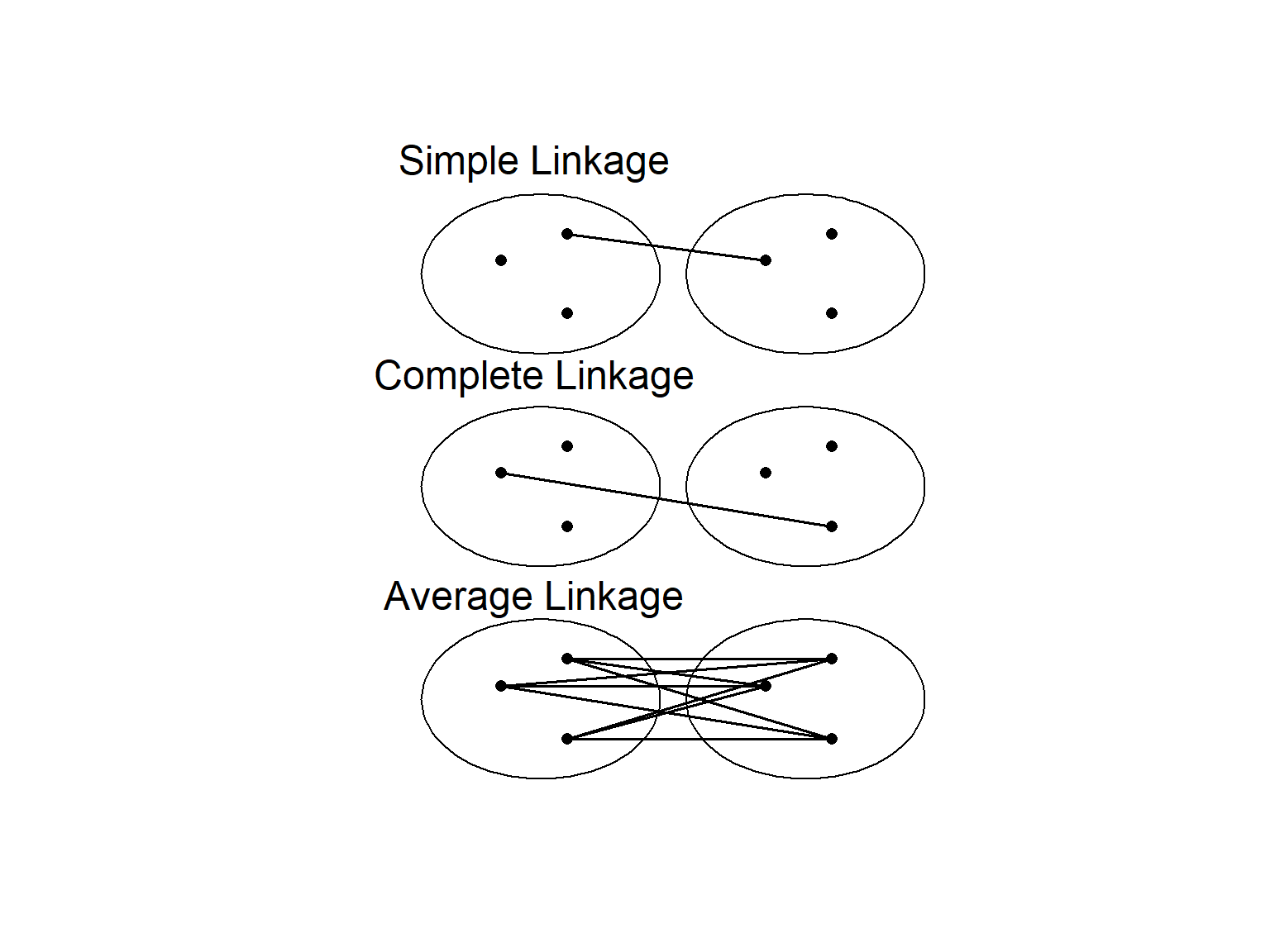
Figure 4.3: Different methods of determining similarity between clusters
4.2.1.1 Single Linkage Cluster Analysis
Single linkage cluster analysis is one of the easiest to explain. It is hierarchical, agglomerative technique. We start by creating a matrix of similarity (or dissimilarity) indices between the units we want to compare.
Then we find the most similar pair of samples, and that will form the 1st cluster. Next, we find either: (a) the second most similar pair of samples or (b) highest similarity between a cluster and a sample, or (c) most similar pair of clusters, whichever is greatest. We then continue this process until until there is one big cluster. Remember that in single linkage, similarity between two clusters = similarity between the two nearest members of the clusters. Or if we are comparing a sample to a cluster, the similarity is defined as the similarity between sample and the nearest member of the cluster.
Let’s try this with simulated data where we have 5 data units (e.g., sites, species, genes), that each have 5 different quantitative characters (e.g., number of individuals of a given species, morphological features, functions).
cls = data.frame(a = c(5, 6, 34, 1, 12), b = c(10, 5, 2, 3, 4),
    c = c(10, 59, 32, 3, 40), d = c(2, 63, 10, 29, 45), e = c(44,
        35, 40, 12, 20))
clsd = dist(t(cls), method = "euclidean")
round(clsd, 0)
a b c d
b 33
c 60 71
d 76 76 36
e 51 62 48 66We can see that we construct the cluster diagram by first grouping a and b, followed by c & d, and so on (Fig. 4.4).
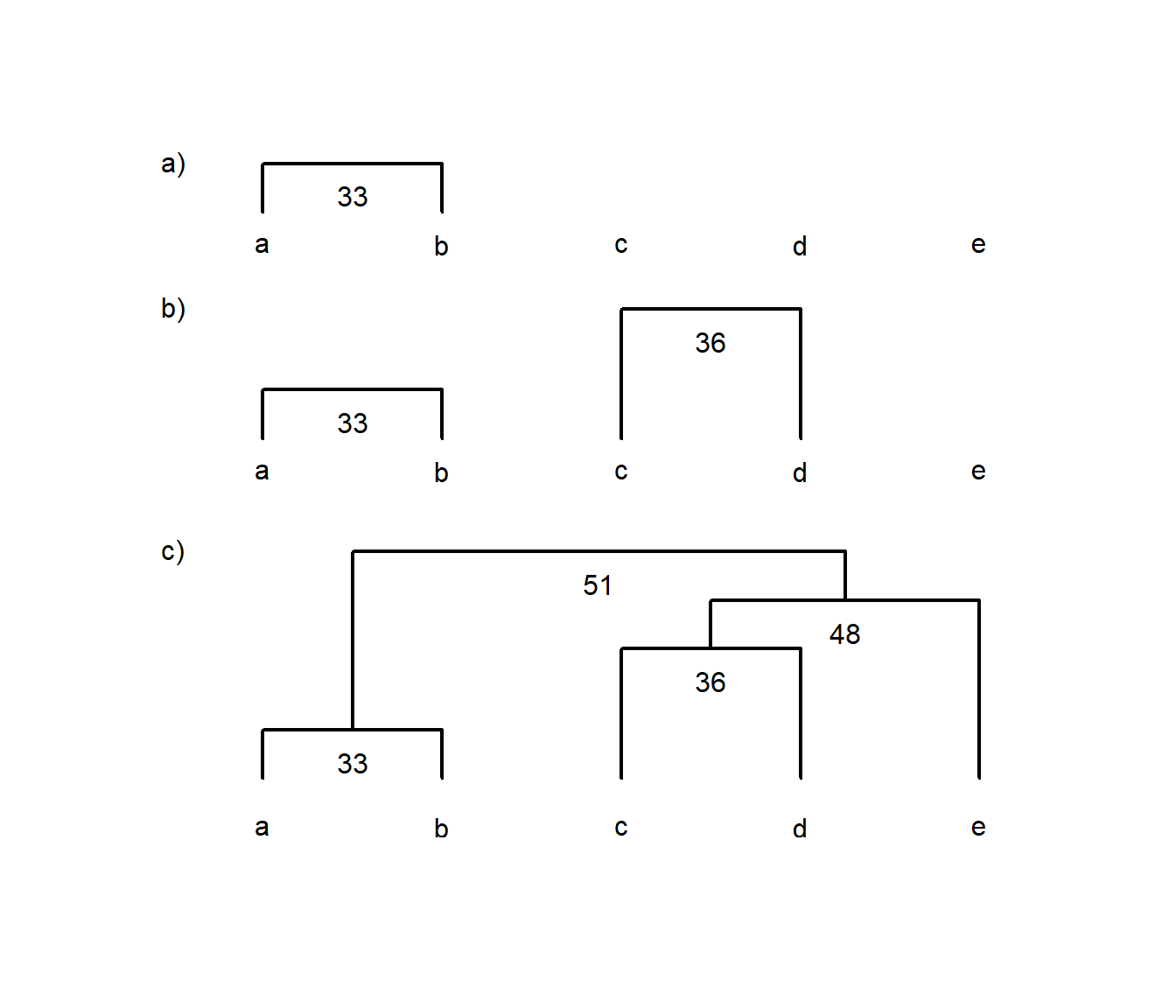
Figure 4.4: Example of using a dissimilarity matrix to construct a single-linkage cluster diagram. Each panel labelled a), b) and c) shows each successive step in constructing the diagram for items a to e, where numbers indicate the similarity between two items, groups or a group and an item
4.2.1.2 How many clusters?
These hierarchical methods just keep going until all objects are included (agglomerative methods), or are each in their own group (divisive methods). However, neither endpoint is very useful. How do we select the number of groups? There are metrics and techniques to make this decision more objective (see the NbClust package). In this brief introduction, we’ll just mention that for hierarchical methods, you can determine the number of groups a given degree of similarity, or set the number of groups and find the degree of similarity that results in that number of groups. Let’s try. We’ll use the cutree() function that works on cluster diagrams produced by the hclust() function (Fig. 4.5).
If we set our dissimilarity threshold at 40, we find that there are three groups: a&b, c&d, and e in its own group.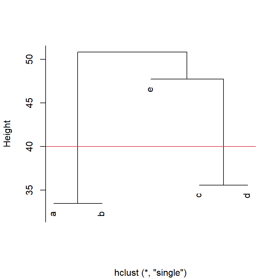
Figure 4.5: Cluster diagram produced by the function hclust() with cut-off line at euclidean distance=40 for group membership
a b c d e
1 1 2 2 3
4.2.2 Partitional clustering and Fuzzy clustering
There are other means of clustering data of course. Partitional clustering is the division of data objects into non-overlapping subsets, such that each data object is in exactly one subset. In one version of this, k-means clustering, each cluster is associated with a centroid (center point), and each data object is assigned to the cluster with the closest centroid. In this method, the number of clusters, K, must be specified in advance. Our method is:
- Choose the number of K clusters
- Select K points as the initial centroids
- Calculate the distance of all items to the K centroids
- Assign items to closest centroid
- Recompute the centroid of each cluster
- Repeat from (3) until clusters assignments are stable
K-means has problems when clusters are of differing sizes and densities, or are non-globular shapes. It is also very sensitive to outliers.
In contrast to strict (or hard) clustering approaches, fuzzy (or soft) clustering methods allow multiple cluster memberships of the clustered items. Fuzzy clustering is commonly achieved by assigning to each item a weight of belonging to each cluster. Thus, items at the edge of a cluster may be in a cluster to a lesser degree than items at the center of a cluster. Typically, each item has as many coefficients (weights) as there are clusters that sum up for each item to one.
4.2.3 R functions for clustering
hclust() (base R, no library needed) calculates hierarchical, agglomerative clusters and has its own plot function.
agnes() (library cluster) Contains six agglomerative algorithms, some not included in hclust.
diana() divisive hierarchical clustering
kmeans() kmeans clustering
fanny()(cluster package) fuzzy clustering
4.2.4 Example: Cluster analysis of isotope data
Let’s try some of these methods on some ecological data. Try to work through the exercise semi-independently. Our first step is to download and import the dataset “Dataset_S1.csv” from Perkins et al. 2014 (see url below). This data contains δ15N and δ13C signatures for species from different food webs. Unfortunately, this data is saved in an .xlsx file.
To read data into R one of the easiest options is to use the read.csv() function with the argument on a .csv file. These Comma Separated Files are one of your best options for reproducible research. They are human readable and easily handled by almost every type of software. In contrast Microsoft Excel uses a propriatory file format, is not fully backwards compatible, and although widely used, is not human readable. As a result, we need special tools to access this file outside of Microsoft software products
We’ll download the data set using download.file(), and read it using the R library openxlsx (see example below). Once you have successfully read your data file into R, take a look at it! Type iso (or whatever you named your data object) to see if the data file was read in properly. Some datasets will be too large for this approach to be useful (the data will scroll right off the page). In that case, there are a number of commands to look at a portion of the dataset. For example, you could use a command like names(iso) or str(iso).
One of the best things to do is plot the imported data. Of course, this is not always possible with very large datasets, but this set should work.
library(openxlsx)
urlj = "https://doi.org/10.1371/journal.pone.0093281.s001"
download.file(urlj, "p.xlsx", mode = "wb")
iso = read.xlsx("p.xlsx")plot(iso$N ~ iso$C, col = as.numeric(as.factor(iso$Food.Chain)),
xlim = c(-35, 0), pch = as.numeric(as.factor(iso$Species)),
xlab = expression(paste(delta, "13C")), ylab = expression(paste(delta,
"15N")))
legend("topright", legend = unique(as.factor(iso$Food.Chain)),
pch = 1, col = as.numeric(unique(as.factor(iso$Food.Chain))),
bty = "n", title = "Food chain")
legend("bottomright", legend = as.character(unique(as.factor(iso$Species))),
pch = as.numeric(unique(as.factor(iso$Species))), bty = "n",
title = "Species")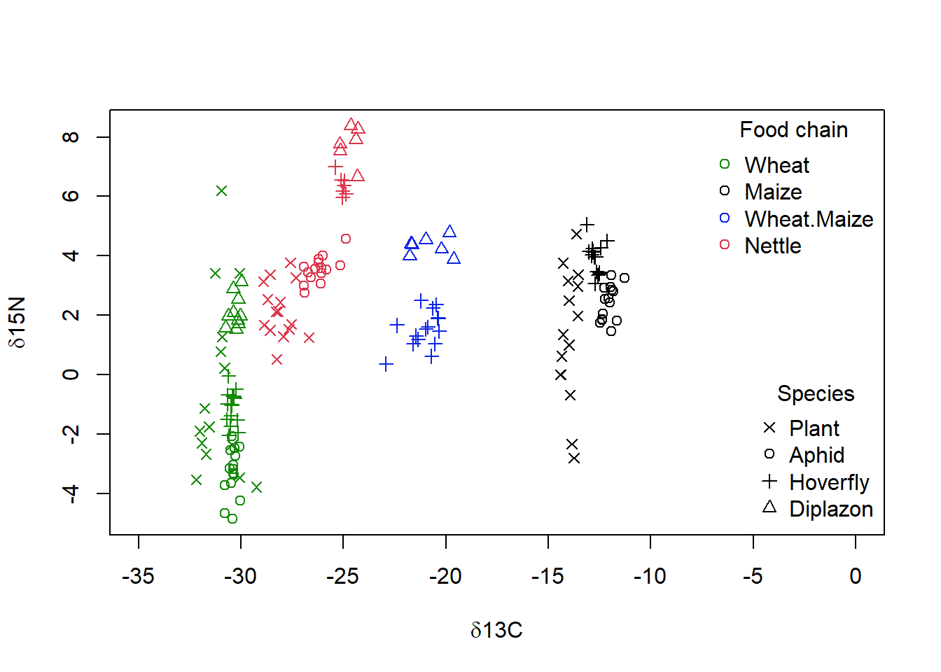
Figure 4.6: Isotope data from Perkins et al (2014), showing the both the food web membership as given by the dominant plants (colour) and species (symbol) of each sample vs the carbon (‘d13C’) and nitrogen (‘d15N’) isotope signature. Higher tropic levels are found closer to the top of the graph, and food webs with more C4 plant metabolism are found more to the right
We are going to use this data set to see if a cluster analysis on δ15N and δ13C can identify the foodweb. That is we are going to see if the latent variables identified by our clustering method match up to what we think we know about the data. Our first step is to create a dissimilarity matrix, but even before this, we must select that part of the data that we wish to use, just the δ15N and δ13C data, not the other components of the dataframe for the downloaded data.
In addition, our analysis will be affected by the missing data. So let’s get remove those rows with missing data right now using the complete.cases() function. The function returns a value of TRUE for every row in a dataframe that no missing values in any column. So niso=iso[complete.cases(mydata),], will be a new data frame with only complete row entries.
The function dist() will generate a matrix of the pairwise Euclidean distances between pairs of observations. Now that you have a dissimilarity matrix, you can complete a cluster analysis. The function hclust() will produce a data frame that can be sent to the plot() function to visualize the recommended clustering. The method used to complete the analysis is indicated below the graph. Please adjust the arguments of the function to complete a single linkage analysis (type ?hclust to call the help page for the function and determine the method to do this).
str(iso)'data.frame': 165 obs. of 7 variables:
$ Replicate : num 1 2 3 4 5 6 7 8 9 10 ...
$ Food.Chain : chr "Wheat" "Wheat" "Wheat" "Wheat" ...
$ Species : chr "Plant" "Plant" "Plant" "Plant" ...
$ Tissue : chr "Leaf" "Leaf" "Leaf" "Leaf" ...
$ Lipid.Extracted: chr "No" "No" "No" "No" ...
$ C : num -30.1 -31.7 -30.1 -30.9 -31 ...
$ N : num -3.47 -2.68 3.42 1.27 6.2 ...diso <- dist((iso[, c("C", "N")]), method = "euclidean")
p = hclust(diso, method = "single", )
plot(p, cex = 0.5, main = "", xlab = "")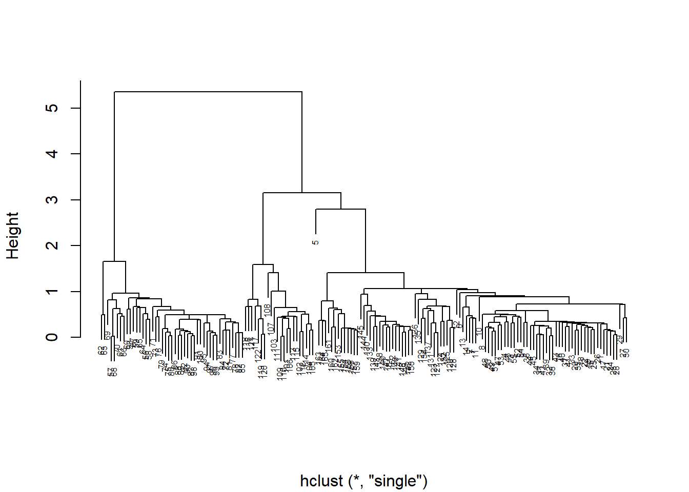
Figure 4.7: A dendrogram of isotope data from Perkins et al. (2014), where links between samples and groups at lower height indicate greater similarity. Note the distance between sample 5 and all other samples
When you graph your cluster using plot(), you notice that there are many individual measurements, but there are only a few large groups. Does it look like there is an outlier? If so, you may want to remove this point from the data set, and then rerun the analysis. The row numbers are used as labels by default, so this is easy to do (niso=niso[-5,]).
When you examine the data set, you noted that there are 4 Food.chain designations. We will use the cutree() function to cut our cluster tree to get the desired number of groups (4), and then save the group numbers to a new column in our original dataframe. For example, iso$clust<- cutree(p,4).We can then plot the data using colours and symbols to see how well our cluster analysis matches the original data classification.
niso = iso[complete.cases(iso), ]
niso = niso[-5, ]
diso <- dist((niso[, c("C", "N")]), method = "euclidean")
p = hclust(diso, method = "single")
niso$clust <- cutree(p, k = 4)

# plotting the data with 4 groups identified by the
# single-linkage cluster analysis superimposed
plot(niso$N ~ niso$C, col = as.numeric(as.factor(niso$clust)),
    xlim = c(-35, 0), pch = as.numeric(as.factor(niso$Species)),
    xlab = expression(paste(delta, "13C")), ylab = expression(paste(delta,
        "15N")))

legend("topright", legend = unique(as.factor(niso$clust)), pch = 1,
    col = as.numeric(unique(as.factor(niso$clust))), bty = "n",
    title = "cluster")

legend("bottomright", legend = as.character(unique(as.factor(niso$Species))),
    pch = as.numeric(unique(as.factor(niso$Species))), bty = "n",
    title = "Species")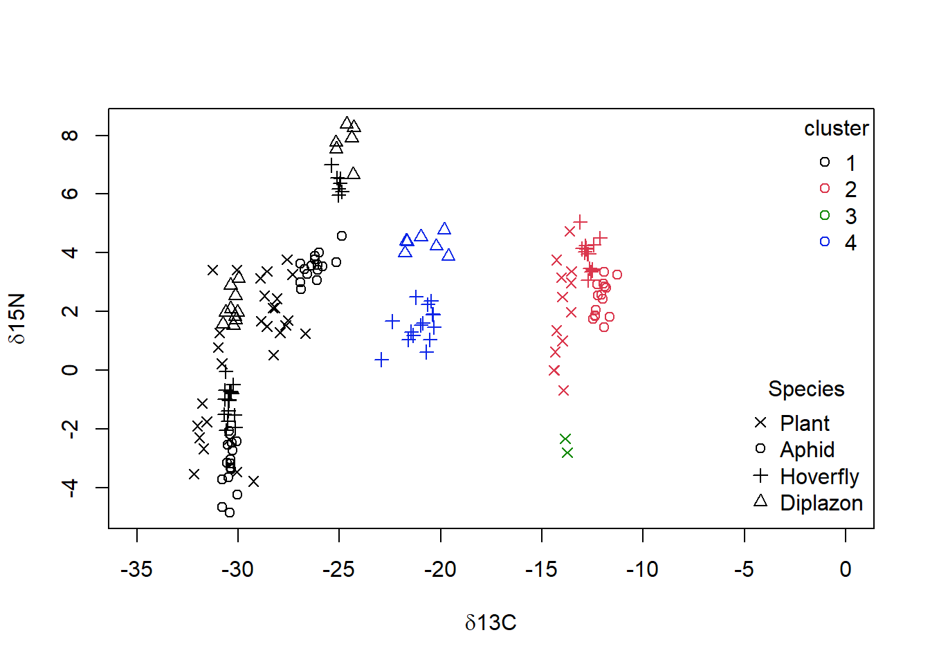
Figure 4.8: Data from Perkins et al (2014) with grouping from single linkage clustering superimposed with calculated clusters 1 to 4 as well as species categories of ‘Plant,’ ‘Aphid,’ ‘Diplazon’ and ‘Hoverfly’ with varying symbols
It doesn’t look like our cluster algorithm is matching up with our Food.chain data categories very well. Wheat- and Nettle-based food chains cannot be distinguished, which makes sense when you consider that both of these plants are terrestrial and use a C3 photosynthesis system. If you are not happy with the success of this clustering algorithm you could try other variants (e.g., “complete” linkage) and a different number of groups.
Exercise 2 Try a non-hierarchical cluster analysis on the same data to see if it works better. Use the kmeans() function, which requires that we select the required number of clusters (4) ahead of time. Once you have your clustering, plot your results.
4.3 Ordination
While cluster analysis lets us visualize multivariate data by grouping objects into discrete categories, ordination uses continuous axes to help us accomplish the same task. Physicists grumble if space exceeds four dimensions, while biologists typically grapple with dozens of dimensions. We can “order” this multivariate data to produce a low dimensional picture (i.e., a graph in 1-3 dimensions). Just like cluster analysis, we will use similarity metrics to accomplish this. Also like cluster analysis, simple ordination is not a statistical test: it is a method of visualizing data.
Essentially, we find axes in the data that explain a lot of variation, and rotate so we can use the axes as our dimensions of visual representation (Fig. 4.9). I’ve left the scatter about the line, but actually each point would have only a location on the synthetic xy axis.
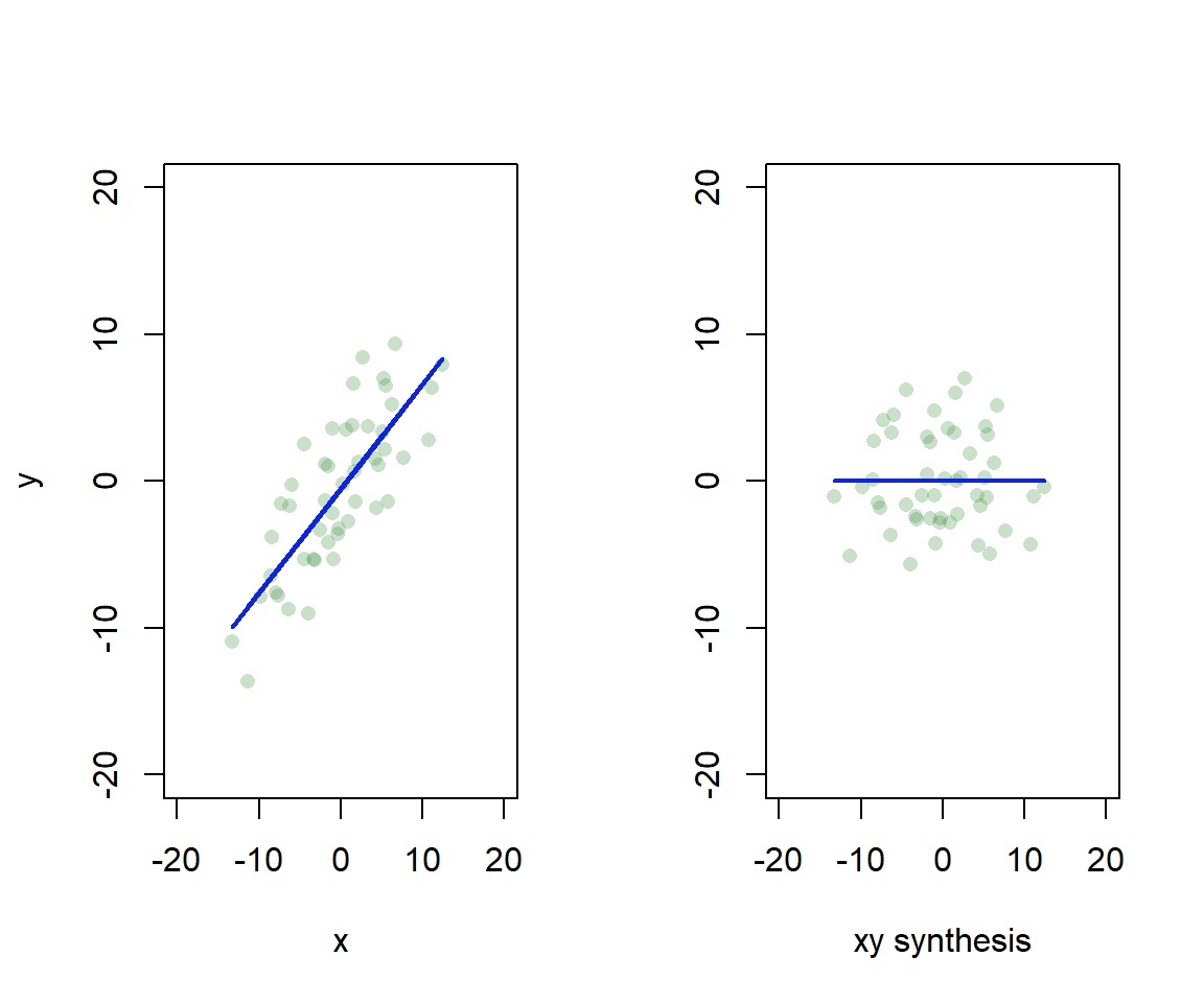
Figure 4.9: Synthetic axis rotation in ordination. We find the axis in 2D that explains most variation, and rotate to give a 1D representation
Another way to think about it is that we are going to summarize the raw data, which has many variables, p, by a smaller set of synthetic variables, k (Fig. 4.10). If the ordination is informative, it reduces a large number of original correlated variables to a small number of new uncorrelated variables. But it really is a bit of a balancing act between clarity of representation, ease of understanding, and oversimplification. We will lose information in this data reduction, and if that information is important, then we can make the multivariate data harder to understand! Also note that if the original variables are not correlated, then we won’t gain anything with ordination.
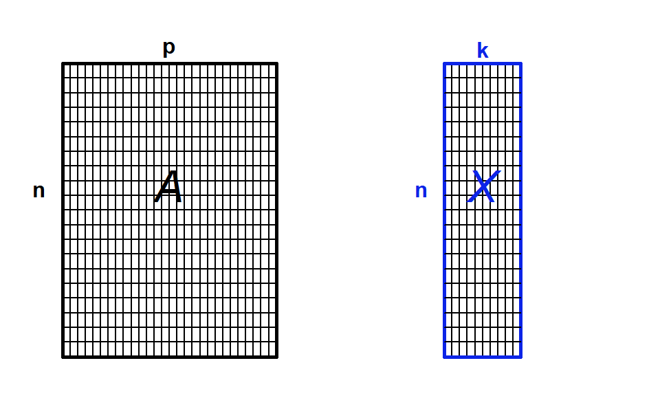
Figure 4.10: Ordination as data reduction. We summarize data with many observations (n) and variables (p) by a smaller set of derived or synthetic variables (k)
There are lots of different ways to perform an ordination, but most methods are based on extracting the eigenvalues of a similarity matrix. The four most commonly used methods are: Principle Component Analysis (PCA), which is the main eigenvector-based method, Correspondence Analysis (CA) which is used used on frequency data, Principle Coordinate Analysis (PCoA) which works on dissimilarity matrices, and Non Metric Multidimensional Scaling (nMDS) which is not an eigenvector method, instead it represents objects along a predetermined number of axes. Legendre & Legendre (2012) provide a nice summary of when you can use each method (Table 4.6). I would like to reiterate that this is a very basic introduction to these methods, and once you are oriented, I suggest you go in search materials authored by experts like Legendre & Legendre (2012), and related materials for R such as Borcard et al. (2011).
| Method | Distance | Variables |
|---|---|---|
| Principal component analysis (PCA) | Euclidean | Quantitative data, but not species community data |
| Correspondence analysis (CA) | \(\chi^2\) | Non-negative, quantitiative or binary data (e.g., species frequencies or presence/absence data) |
| Principal coordinate analysis (PCoA) | Any | Quantitative, semiquantitative, qualitative, or mixed data |
| Nonmetric multidimensional scaling (nMDS) | Any | Quantitative, semiquantitative, qualitative, or mixed data |
4.3.1 Principal Components Analysis (PCA)
Principal Components Analysis (PCA) is probably the most widely-used and well-known of the standard multivariate methods. It was invented by Pearson (1901) and Hotelling (1933), and first applied in ecology by Goodall (1954) under the name “factor analysis” (NB “principal factor analysis” is also a synonym of PCA). Like most ordination methods, PCA takes a data matrix of n objects by p variables, which may be correlated, and summarizes it by uncorrelated axes (principal components or principal axes) that are linear combinations of the original p variables. The first k components display as much as possible of the variation among objects. PCA uses Euclidean distance calculated from the p variables as the measure of dissimilarity among the n objects, and derives the best possible k-dimensional representation of the Euclidean distances among objects, where \(k < p\) .
We can think about this spatially. Objects are represented as a cloud of n points in a multidimensional space with an axis for each of the p variables. So the centroid of the points is defined by the mean of each variable, and the variance of each variable is the average squared deviation of its n values around the mean of that variable (i.e., \(V_i= \frac{1}{n-1}\sum_{m=1}^{n}{(X_{im}-\bar{X_i)}^2}\)). The degree to which the variables are linearly correlated is given by their covariances \(C_{ij}=\frac{1}{n-1}\sum_{m=1}^n{(X_{im}-\bar{X_i})(X_{jm}-\bar{X_j})}\). The objective of PCA is to rigidly rotate the axes of the p-dimensional space to new positions (principal axes) that have the following properties: they are ordered such that principal axis 1 (or the principal component has the highest variance, axis 2 has the next highest variance etc, and the covariance among each pair of principal axes is zero (the principal axes are uncorrelated) (Fig. 4.11).
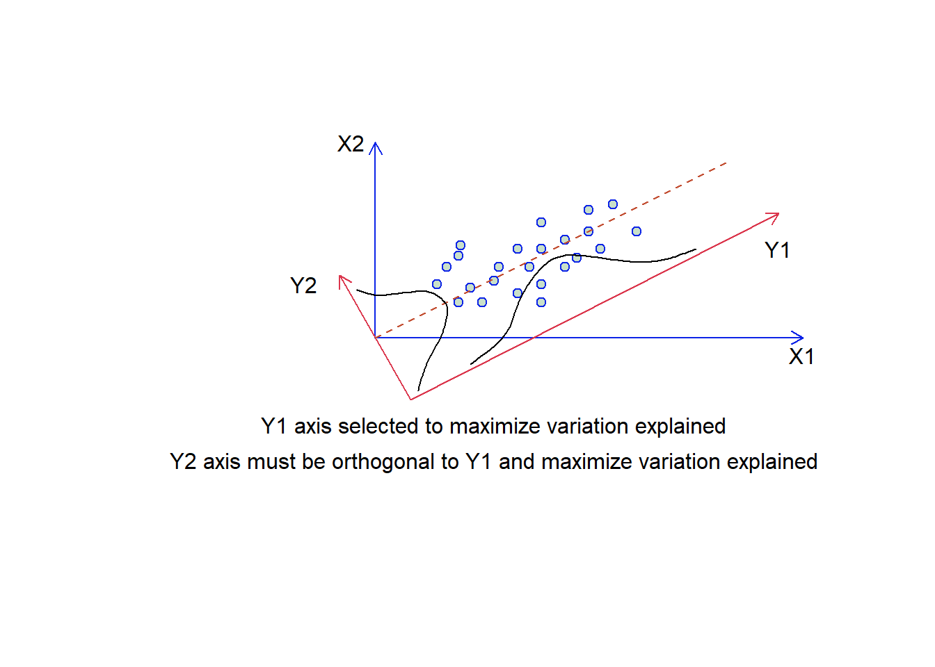
Figure 4.11: Selecting the synthetic axes in ordination. We have two overlaid plots where those axes labelled X1 and X2 are the original data, and those labelled Y1 and Y2 are our synthetic axis. The two guassian functions suggest how much variation is present on each of the two y synthetic axes.
So our steps are to compute the variance-covariance matrix of the data, calculate the eigenvalues of this matrix and then calculate the associated eigenvectors. Then, the jth eigenvalue is the variance of the jth principle component and the sum of all the eigenvalues is the total variance explained. The proportion of variance explained by each component, or synthetic axis, is the eigenvalue for the component divided by the total variance explained, while the rotations are the eigenvectors. Dimensionality reduction is the same as first rotating the data with the eigenvalues to be aligned with the principle components, then display using only the components with the greatest eigenvalues.
4.3.1.1 Example: PCA on the iris data
We’re going to use a sample dataset in R and the base R version of PCA to start exploring this data analysis technique. Get the iris dataset into memory by typing data(“iris”). Take a look at this dataset using the head(), str() or summary() functions. For a multivariate data set, you would also like to take a look at the pairwise correlations. Remember that PCA can’t help us if the variables are not correlated. Let’s use the pairs() function to do this
data("iris")
str(iris)
'data.frame': 150 obs. of 5 variables:
$ Sepal.Length: num 5.1 4.9 4.7 4.6 5 5.4 4.6 5 4.4 4.9 ...
$ Sepal.Width : num 3.5 3 3.2 3.1 3.6 3.9 3.4 3.4 2.9 3.1 ...
$ Petal.Length: num 1.4 1.4 1.3 1.5 1.4 1.7 1.4 1.5 1.4 1.5 ...
$ Petal.Width : num 0.2 0.2 0.2 0.2 0.2 0.4 0.3 0.2 0.2 0.1 ...
$ Species : Factor w/ 3 levels "setosa","versicolor",..: 1 1 1 1 1 1 1 1 1 1 ...summary(iris[1:4]) Sepal.Length Sepal.Width Petal.Length Petal.Width
Min. :4.300 Min. :2.000 Min. :1.000 Min. :0.100
1st Qu.:5.100 1st Qu.:2.800 1st Qu.:1.600 1st Qu.:0.300
Median :5.800 Median :3.000 Median :4.350 Median :1.300
Mean :5.843 Mean :3.057 Mean :3.758 Mean :1.199
3rd Qu.:6.400 3rd Qu.:3.300 3rd Qu.:5.100 3rd Qu.:1.800
Max. :7.900 Max. :4.400 Max. :6.900 Max. :2.500 pairs(iris[1:4], main = "Iris Data", pch = as.numeric(iris$Species) +
14, col = as.numeric(iris$Species) + 1)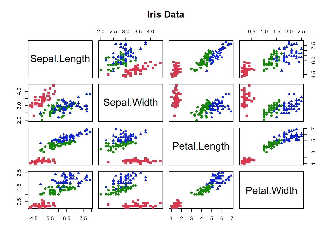
Figure 4.12: Correlation matrix for characteristics of each individual the iris data. Colours give species identity
The colours let us see the data for each species, the graph is all the pairwise plots of each pair of the 4 variables (Fig. 4.12). Do you see any correlations?
If there seem to be some correlations we might use PCA to reduce the 4 dimensional variable space to 2 or 3 dimensions. Let’s rush right in and use the prcomp() function to run a PCA on the numerical data in the iris dataframe. Save the output from the function to a new variable name so you can look at it when you type that name. The str() function will show you what the output object includes. If you use the summary() function, R will tell you what proportion of the total variance is explained by each synthetic axis.
pca <- prcomp(iris[, 1:4])
summary(pca)
Importance of components:
PC1 PC2 PC3 PC4
Standard deviation 2.0563 0.49262 0.2797 0.15439
Proportion of Variance 0.9246 0.05307 0.0171 0.00521
Cumulative Proportion 0.9246 0.97769 0.9948 1.000004.3.1.2 Standardize your data
There is a problem though, let’s examine the variance in the raw data. Use the apply() function to quickly calculate the variance in each of the numeric columns of the data as apply(iris[,1:3], 1, var). What do you see? Are the variances of each the columns comparable?
apply(iris[, 1:4], 2, var)Sepal.Length Sepal.Width Petal.Length Petal.Width
0.6856935 0.1899794 3.1162779 0.5810063 Using covariances among variables only makes sense if they are measured in the same units, and even then, variables with high variances will dominate the principal components. These problems are generally avoided by standardizing each variable to unit variance and zero mean as \(X_{im}^{'}=\frac{x_{im}-\bar{X_i}}{sd_i}\) where sd is the standard deviation of variable i. After standardizaton, the variance of each variable is 1 and the covariances of the standardized variables are correlations.
If you look at the help menu, the notes for the use of prcomp() STRONGLY recommend standardizing the data. To do this there is a built in option. We just need to set scale=TRUE. Let’s try again with data standardization. Save your new PCA output to a different name. Take a look at the summary.
p <- prcomp(iris[, 1:4], scale = TRUE)
summary(p)
Importance of components:
PC1 PC2 PC3 PC4
Standard deviation 1.7084 0.9560 0.38309 0.14393
Proportion of Variance 0.7296 0.2285 0.03669 0.00518
Cumulative Proportion 0.7296 0.9581 0.99482 1.00000We now have less variance explained by axis 1. This makes sense, because, as we will see in a moment, axis 1 is strongly influenced by petal length, but in the unstandardized data, petal length had larger variance than anything else.
4.3.1.3 Choose your axes
Now we need to determine how many axes to use to interpret our analysis. For 4 variables it is easy enough to just look that the amount of variance, as we just did. For larger numbers of variables a plot can be useful. The screeplot() function will output the variance (called inertia) explained by each of the principle component axes, and you can make a decision based on that.
screeplot(p, type = ("lines"), main = "", pch = 16, cex = 1)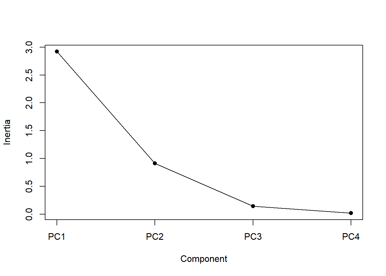
Figure 4.13: Screeplot: a display of the variance explained by each of the principal components (i.e., synthetic axes). The variance explained decreases for each subsequent axis
An ideal curve should be steep, then bend at an “elbow” — this is your cutting-off point — and after that flattens out. To deal with a not-so-ideal scree plot curve you can apply the Kaiser rule: pick PCs with eigenvalues of at least 1. Or you can select using the proportion of variance where the PCs should be able to describe at least 80% of the variance.
It looks like synthetic axes 1 & 2 explain most of the variation. This is, of course, always true, but in this case only a very small proportion of the variance is explained by axes 3 & 4, so we don’t need to consider them any further. So let’s plot axes 1 & 2.
4.3.1.4 Plot your ordination
A PCA plot displays our samples in terms of their position (or scores) on the new axes. We can add information about how much variation each axis explains, and colour our points to match species identity. In this 2D representation of 4 dimensional space, it looks like species I. versicolor and I. viriginica are the most similar (Fig. 4.14).
pvar = round(summary(p)$importance[2, 1:2], 2)

plot(p$x[, 1:2], col = as.numeric(iris$Species) + 1, ylim = c(-3,
    3), cex = 1, pch = as.numeric(iris$Species) + 14, xlab = paste0("PC1 (",
    pvar[1] * 100, "%)"), ylab = paste0("PC2 (", pvar[2] * 100,
    "%)"))
legend("topright", legend = unique(iris$Species), pch = as.numeric(unique(iris$Species)) +
    14, col = c(2, 3, 4), bty = "n")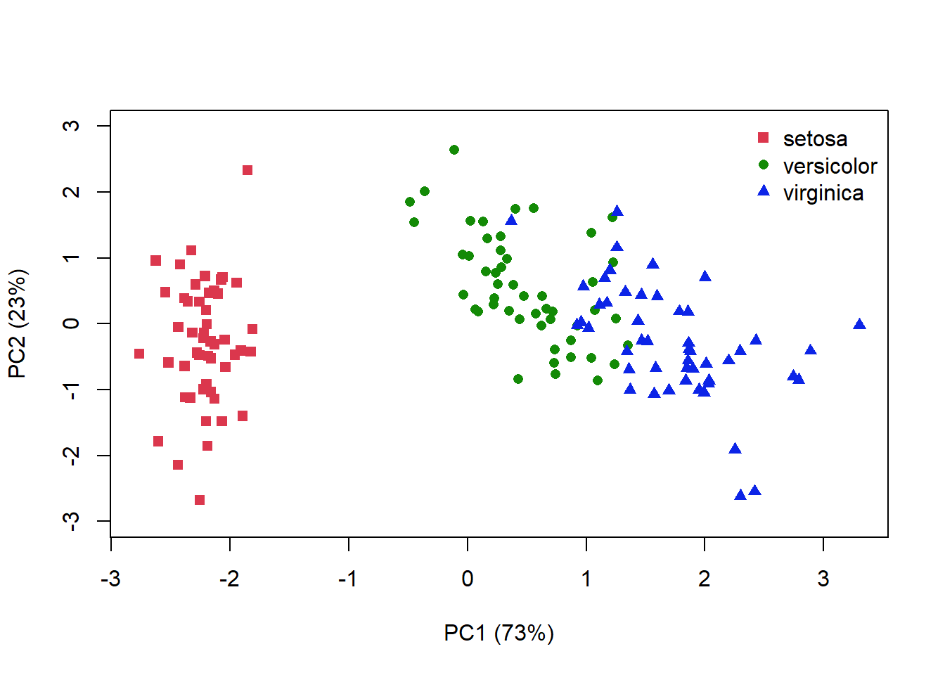
Figure 4.14: PCA plot for the iris data where distance is related to the similarlity between each sample. Species identity is indicated by colour and symbol shape
I’ve plotted the amount of variance explained by each axis, but remember that the 1st axis always explains the most variance. Your interpretation of the ordination plot hould reflect this fact
We can also plot information about influence the various characteristics are having on each of the axes. The eigenvectors used for the rotation give us this information. So let’s just print that out.
| PC1 | PC2 | PC3 | PC4 | |
|---|---|---|---|---|
| Sepal.Length | 0.52 | -0.38 | 0.72 | 0.26 |
| Sepal.Width | -0.27 | -0.92 | -0.24 | -0.12 |
| Petal.Length | 0.58 | -0.02 | -0.14 | -0.80 |
| Petal.Width | 0.56 | -0.07 | -0.63 | 0.52 |
We can see that a lot of information is coming from the petal variables for PC1, but less from the sepal variables (Table 4.7). We can plot this out to show how strongly each variable affects each principle component (or synthetic axis).
plot(NA, ylim = c(-5, 4), xlim = c(-5, 4), xlab = paste0("PC1 (",
    pvar[1] * 100, "%)"), ylab = paste0("PC2 (", pvar[2] * 100,
    "%)"))
abline(v = 0, col = "grey90")
abline(h = 0, col = "grey90")
# Get co-ordinates of variables (loadings), and multiply by
# 10
l.x <- p$rotation[, 1] * 4
l.y <- p$rotation[, 2] * 4
# Draw arrows
arrows(x0 = 0, x1 = l.x, y0 = 0, y1 = l.y, col = 5, length = 0.15,
    lwd = 1.5)
# Label position
l.pos <- l.y  # Create a vector of y axis coordinates
lo <- which(l.y < 0)  # Get the variables on the bottom half of the plot
hi <- which(l.y > 0)  # Get variables on the top half
# Replace values in the vector
l.pos <- replace(l.pos, lo, "1")
l.pos <- replace(l.pos, hi, "3")
l.pos[4] <- "3"
l.x[3:4] <- l.x[3:4] + 0.75
# Variable labels
text(l.x, l.y, labels = row.names(p$rotation), col = 5, pos = l.pos,
    cex = 1)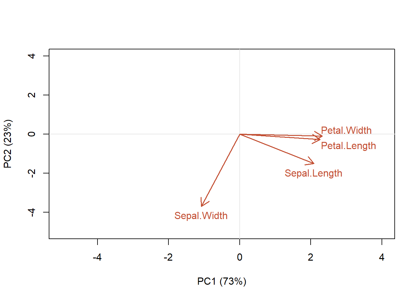
Figure 4.15: Contribution of each of the characteristics of the samples to the first two principal component axes
We can see that petal width and length are aligned along the PC1 axis, while PC2 explains more variation in sepal width (Fig. 4.15). That is, petal length and petal width variables are the most important contributors to the first PC. Sepal width variable is the most important contributor to the second PC. To interpret the variable plot remember that positively correlated variables are grouped close together (e.g., petal length and width). Variables with about a 90 angle are probably not correlated (sepal width is not correlated with the other variables), while negatively correlated variables are positioned on opposite sides of the plot origin (~180 angle; opposed quadrants). However, the direction of the axes is arbitrary! The distance between variables and the origin measures the contribution of the variables to the ordination. A shorter arrow indicates its less importance for the ordination. Variables that are away from the origin are well represented. Avoid the mistake of interpreting the relationships among variables based on the proximities of the apices (tips) of the vector arrows instead of their angles.
Another way to portray this information is to create a biplot which, in addition to the coordinates of our samples on the synthetic axes PC1 and PC2, also provides information about how the variables align along the synthetic axes. (Fig. 4.16). According to the plot, I. versicolor and I. virginica have similar petal length and width, but note that the axis direction is arbitrary and coud not be interpreted as suggesting that these two species have longer petal widths than I.setosa.
I have used an arbitrary scaling to display the variable loadings on each axis. Some of the R packages will use a specific scaling that will emphasize particular parts of the plot, either preserving the Euclidean distances between samples or the correlations/covariances between variables (e.g., the vegan package can do this for you, see section 4.4.5).
plot(p$x[, 1:2], pch = as.numeric(iris$Species) + 14, col = as.numeric(iris$Species) +
    1, ylim = c(-5, 4), xlim = c(-4, 4), cex = 1, xlab = paste("PC1 (",
    pvar[1] * 100, "%)"), ylab = paste("PC2 (", pvar[2] * 100,
    "%)"))
legend("topleft", legend = unique(iris$Species), pch = as.numeric(unique(iris$Species)) +
    14, col = c(2, 3, 4), bty = "n")

# Get co-ordinates of variables (loadings), and multiply by
# a constant
l.x <- p$rotation[, 1] * 4
l.y <- p$rotation[, 2] * 4
# Draw arrows
arrows(x0 = 0, x1 = l.x, y0 = 0, y1 = l.y, col = 5, length = 0.15,
    lwd = 1.5)
# Label position
l.pos <- l.y  # Create a vector of y axis coordinates
lo <- which(l.y < 0)  # Get the variables on the bottom half of the plot
hi <- which(l.y > 0)  # Get variables on the top half
# Replace values in the vector
l.pos <- replace(l.pos, lo, "1")
l.pos <- replace(l.pos, hi, "3")
l.pos[4] <- "3"
l.x[3:4] <- l.x[3:4] + 0.75
# Variable labels
text(l.x, l.y, labels = row.names(p$rotation), col = 5, pos = l.pos,
    cex = 1)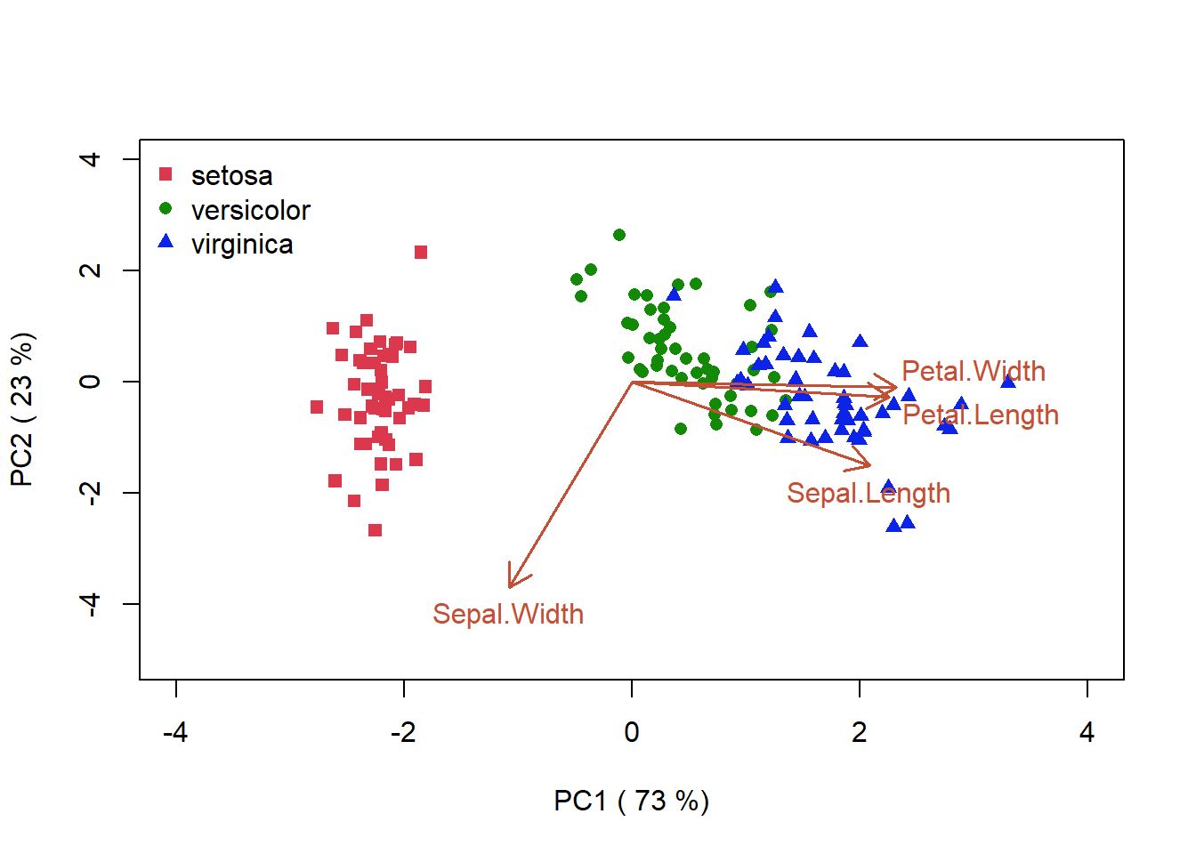
Figure 4.16: PCA biplot for the iris data. This plot combines the vectors that should how the various characteristics of the samples are aligned with the synthetic axes, and the similarity of the the samples as given by their proximity in the ordination space
There are some final points to note regarding interpretation. Principal components analysis assumes the relationships among variables are linear, so that the cloud of points in p-dimensional space has linear dimensions that can be effectively summarized by the principal axes. If the structure in the data is nonlinear (i.e., the cloud of points twists and curves its way through p-dimensional space), the principal axes will not be an efficient and informative summary of the data.
For example, in community ecology, we might use PCA to summarize variables whose relationships are approximately linear or at least monotonic (e.g., soil properties might be used to extract a few components that summarize main dimensions of soil variation). However, in general PCA is generally not useful for ordinating community data because relationships among species and environmental factors are highly nonlinear.
This nonlinearity can lead to characteristic artifacts, where, for example, community trends along environmental gradients appear as “horseshoes” in PCA ordinations because of low species density at opposite extremes of an environmental gradiant appear relatively close together in ordination space (i.e., “arch” or “horseshoe” effect).
4.3.1.5 R functions for PCA
prcomp() (base R, no library needed)
rda() (vegan)
PCA() (FactoMineR library)
dudi.pca() (ade4)
acp() (amap)
4.3.2 Principle Coordinates Analysis (PCoA)
The PCoA method may be used with all types of distance descriptors, and so might be able to avoid some problems of PCA. Although, a PCoA computed on a Euclidean distance matrix gives the same results as a PCA conducted on the original data
4.3.2.1 R functions for PCoA
cmdscale() (base R, no package needed)
smacofSym() (library smacof)
pco()(ecodist)
pco()(labdsv)
pcoa()(ape)
dudi.pco()(ade4)
4.3.3 Nonmetric Multidimensional Scaling (nMDS)
Like PCoA, the method of nonmetric multidimensional scaling (nMDS), produces ordinations of objects from any resemblance matrix. However, nMDS compresses the distances in a non-linear way and its algorithm is computer-intensive, requiring more computing time than PCoA. PCoA is faster for large distance matrices.
This ordination method does not to preserve the exact dissimilarities among objects in an ordination plot, instead it represents as well as possible the ordering relationships among objects in a small and specified number of axes. Like PCoA, nMDS can produce ordinations of objects from any dissimilarity matrix. The method can also cope with missing values, as long as there are enough measures left to position each object with respect to a few others. nMDS is not an eigenvalue technique, and it does not maximize the variability associated with individual axes of the ordination.
In this computational method the steps are:
Specify the desired number m of axes (dimensions) of the ordination.
Construct an initial configuration of the objects in the m dimensions, to be used as a starting point of an iterative adjustment process. (tricky: the end result may depend on this. A PCoA ordination may be a good start. Otherwise, try many independent runs with random initial configurations. The package vegan has a function that does this for you)
Try to position the objects in the requested number of dimensions in such a way as to minimize how far the dissimilarities in the reduced-space configuration are from being monotonic to the original dissimilarities in the association matrix
The adjustment goes on until the difference between the observed and modelled dissimilarity matrices (called “stress”), can cannot be lowered any further, or until it reaches a predetermined low value (tolerated lack-of-fit).
Most nMDS programs rotate the final solution using PCA, for easier interpretation.
We can use a Shephard plot to get information about the distortion of representation. A Shepard diagram compares how far apart your data points are before and after you transform them (ie: goodness-of-fit) as a scatter plot. On the x-axis, we plot the original distances. On the y-axis, we plot the distances output by a dimension reduction algorithm. A really accurate dimension reduction will produce a straight line. However since information is almost always lost during data reduction, at least on real, high-dimension data, so Shepard diagrams rarely look this straight.
Let’s try this for the iris data. We can evaluate the quality of the nMDS solution by checking the Shephard plot.
library(vegan)
nMDS <- metaMDS(iris[, -5], distance = "bray", k = 2, trace = FALSE)par(mfrow = c(1, 2))
# Plot the stressplot
stressplot(nMDS, pch = 16, l.col = NA, las = 1)
# Plot the ordination
plot(nMDS$points, pch = as.numeric(iris$Species) + 14, col = as.numeric(iris$Species) +
1, ylim = c(-0.3, 0.3), xlim = c(-0.6, 0.75), cex = 0.7,
xlab = "nMDS1", ylab = "nMDS2")
legend("bottomleft", legend = unique(iris$Species), pch = as.numeric(unique(iris$Species)) +
14, col = c(2, 3, 4), bty = "n", cex = 1)
# Get co-ordinates of variables, and multiply by scale
l.x2 <- nMDS$species[-1, 1] * 1.25
l.y2 <- nMDS$species[-1, 2] * 1.25
# Draw arrows
arrows(x0 = 0, x1 = l.x2, y0 = 0, y1 = l.y2, col = 5, length = 0.1,
lwd = 2)
# Variable labels
l.x1 <- nMDS$species[, 1] * 1.25
l.y1 <- nMDS$species[, 2] * 1.25
text(l.x1, l.y1, labels = row.names(nMDS$species), col = 1, pos = 3,
cex = 0.8)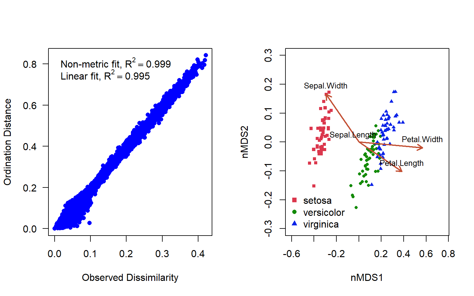
Figure 4.17: Shepard’s plot and ordination plot of an nMDS ordination using 2 axes to represent the varespec data in the vegan package
In addition to the original dissimilarity and ordination distance, the plot displays two correlation-like statistics on the goodness of fit. The nonmetric fit is given by \(R^2\), while the “linear fit” is the squared correlation between fitted values and ordination distances (Fig. 4.17 ). There is some deformation here, but in general the representation is really quite good.
nMDS often achieves a less deformed representation of the dissimilarity relationships among objects than a PCoA in the same number of dimensions. But nMDS is a computer-intensive iterative technique exposed to the risk of suboptimum solutions. In comparison, PCoA finds the optimal solution by eigenvalue decomposition.
4.3.3.1 R functions for nMDS
metaMDS() (vegan package)
isoMDS( ) (MASS)
4.3.4 Example: nMDS and PCoA
We are going to use the vegan package, and some built-in data with it to run the nMDS and PcOA. Varespec is a data frame of observations of 44 species of lichen at 24 sites. We’ll calculate both an nMDS and a PCoA using the (cmdscale() function) on the Bray-Curtis distance matrix of these data. In each case, we will specify that we want 2 dimensions as our output. The vegan wrapper for nMDS ordination (metaMDS()) standardizes our community data by default, using a Wisconsin transform. This is a method of double standardization that avoids negative values in the transformed data, and is completed by first standardizing species data using the maxima, and then the site by totals. We will have to apply this standardization manually for the PCoA analysis, and then calculate the dissimilarity matrix.
library(vegan)
data(varespec)
nMDS <- metaMDS(varespec, trymax = 100, distance = "bray", k = 2,
    trace = FALSE)
svarespec = wisconsin(varespec)
disimvar = vegdist(svarespec, method = "bray")

PCoA <- cmdscale(disimvar, k = 2, eig = T, add = T)
str(PCoA)
List of 5
$ points: num [1:24, 1:2] -0.118 -0.103 0.182 0.486 0.106 ...
..- attr(*, "dimnames")=List of 2
.. ..$ : chr [1:24] "18" "15" "24" "27" ...
.. ..$ : NULL
$ eig : num [1:24] 1.208 0.832 0.743 0.491 0.461 ...
$ x : NULL
$ ac : num 0.178
$ GOF : num [1:2] 0.298 0.298We’ll plot the PCoA and the nMDS side by side to see if they differ, using the par(mfrow()) functions. In this case, our species are the variables and our sites are the objects of our attention. For the nMDS it does not make sense to plot the species as vectors, as that implies directionality or increasing abundance, and there is no reason to assume that the abundance will increase linearly in a given direction across the nMDS plot. For this package, the “species score” is calculated as the weighted average of the site scores, where the weights are the abundance of that species at each site. If we look at the object PCoA we see the new 2D coordinates for each site (“points”). These are raw scores, but we can weight them using the in the same way as the nMDS using the wascores() function. We can plot the results as plot(PCoA$points). But, since this will be a crowded plot, let’s use a vegan package function ordipointlabel() for both instead, which will use an optimization routine to produce the best plot
par(mfrow = c(1, 2))
ordipointlabel(nMDS, pch = c(NA, NA), cex = c(1.2, 0.6), xlim = c(-0.6,
    1.2))
abline(h = 0, col = "grey")
abline(v = 0, col = "grey")


PCoA$species <- wascores(PCoA$points, varespec, expand = TRUE)
ordipointlabel(PCoA, pch = c(NA, NA), cex = c(1.2, 0.6), xlab = "PCoA1",
    ylab = "PCoA2", xlim = c(-0.6, 1), ylim = c(-0.5, 0.6))
abline(h = 0, col = "grey")
abline(v = 0, col = "grey")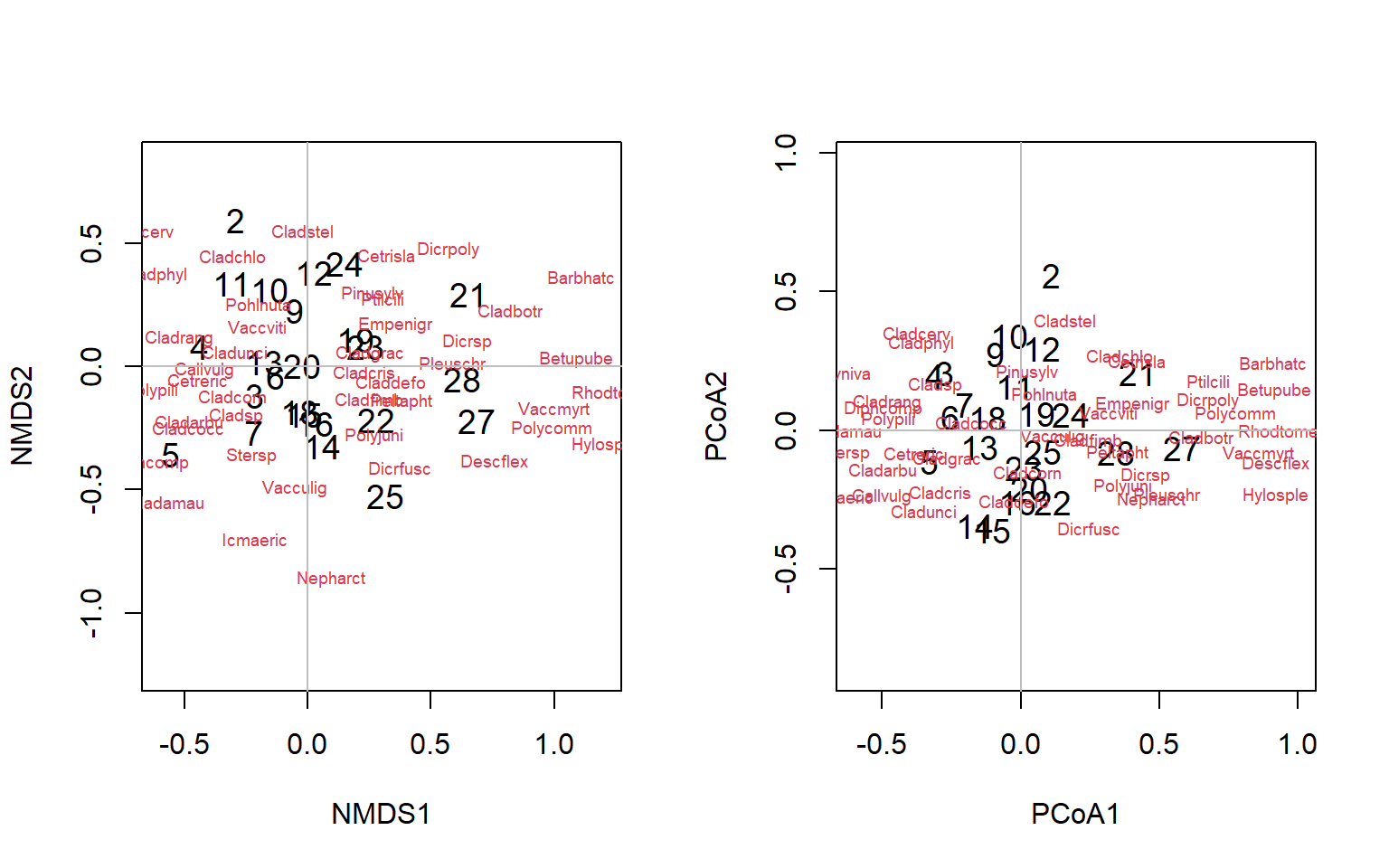
Figure 4.18: Biplots of the lichen data for nMDS and PCoA ordinations
Exercise 3 Provide an interpretation of these plots
4.4 Constrained Ordination
The patterns we see in the previous exercise are created by differences among thie sites in the relative abundances in species aligned with the major direction of difference (e.g. Betupube). However, biologists often go further than this, and attempt to explain the differences in characteristics (in this case, species abundances) that drives data object differences (in this case, sampling sites) by superimposing relationships of environmental variation associated with the sites in a regression type exercise. This is constrained or canonical ordination
Simple (or unconstrained) ordination is done on one data set, and we try to explain/understand the data by examining a graph constructed with a reduced set of orthogonal axes. The ordination is not influenced by external variables; these may only be considered after we construct the ordination. There is no hypotheses or hypothesis testing: this is an exploratory technique only. In unconstrained ordination axes correspond to the directions of the greatest variability within the data set.
In contrast, constrained ordination associates two or more data sets in the ordination and explicitly explores the relationships between two matrices: a response matrix and an explanatory matrix (Fig 4.19). Both matrices are used in the production of the ordination. In this method, we can formally test statistical hypotheses about the significance of these relationships. The constrained ordination axes correspond to the directions of the greatest variability of the data set that can be explained by the environmental variables
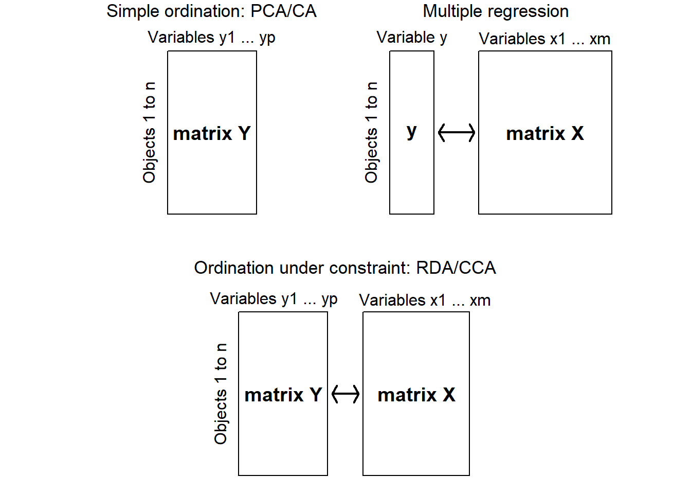
Figure 4.19: Diagram showing the differences between uncontrained ordination, multiple regression and constrained ordination (adapted from Legendre & Legendre 2012)
There are two major methods of constrained commonly used by ecologists. Both combine multiple regression with a standard ordination: Redundancy analysis (RDA) and Canonical correspondence analysis (CCA). RDA preserves the Euclidean distances among objects in matrix, which contains values of Y fitted by regression to the explanatory variables X. CCA preserves the \(\chi^2\) distance (as in correspondence analysis), instead of the Euclidean distance. The calculations are a bit more complex since the matrix contains fitted values obtained by weighted linear regression of matrix of correspondence analysis on the explanatory variables X
4.4.1 Redundancy Analysis
Redundancy analysis was created by Rao (1964) and also independently by Wollenberg (1977).The method seeks, in successive order, linear combinations of the explanatory variables that best explain the variation of the response data. The axes are defined in the space of the explanatory variables that are orthogonal to one another. RDA is therefore a constrained ordination procedure. The difference with unconstrained ordination is important: the matrix of explanatory variables conditions the “weights” (eigenvalues), and the directions of the ordination axes. In RDA, one can truly say that the axes explain or model (in the statistical sense) the variation of the dependent matrix. Furthermore, a global hypothesis (H0) of absence of linear relationship between Y and X can be tested in RDA; this is not the case in PCA.
As in PCA, the variables in Y should be standardized if they are not dimensionally homogeneous (e.g., if they are a mixture of temperatures, concentrations, and pH values), or transformations applicable to community composition data applied if data is species abundance or presence/absence (Legendre & Legendre 2012).
As in multiple regression analysis, matrix X can contain explanatory variables of different mathematical types: quantitative, multistate qualitative (e.g. factors), or binary variables. If present, collinearity among the X variables should be reduced. In cases where several correlated explanatory variables are present, without clear a priori reasons to eliminate one or the other, one can examine the variance inflation factors (VIF) which measure how much the variance of the regression or canonical coefficients is inflated by the presence of correlations among explanatory variables. As a rule of thumb, ter Braak (1988) recommends that variables that have a VIF larger than 20 be removed from the analysis. (Note: always remove the variables one at a time and recompute the analysis, since the VIF of every variable depends on all the others!)
So our steps for an RDA are a combination of the things we would do for a multiple linear regression, and the things we would do for an ordination:
Multivariate linear regression of Y on X: equivalent to regressing each Y response variable on X to calculate vectors of fitted values followed by stacking these column vectors side by side into a new matrix
Test regression for significance using a permutation test
If significant, compute a PCA on matrix of fitted values to get the canonical eigenvalues and eigenvectors
We may also compute the residual values of the multiple regressions and do a PCA on these values
4.4.1.1 R functions for RDA
BEWARE: many things are called rda in R that have nothing to do with ordination!!
rda (vegan package)- this function calculates RDA if a matrix of environmental variables is supplied (if not, it calculates PCA). Two types of syntax are available: matrix syntax - rda (Y, X, W), where Y is the response matrix (species composition), X is the explanatory matrix (environmental factors) and W is the matrix of covariables, or formula syntax (e.g., RDA = rda (Y ~ var1 + factorA + var2*var3 + Condition (var4), data = XW, where var1 is quantitative, factorA is categorical, there is an interaction term between var2 and var3, while var4 is used as covariable and hence partialled out).
We should mention that there are several closely related forms of RDA analysis:
tb-RDA (transformation-based RDA, Legendre & Gallagher 2001): transform the species data with vegan’s decostand(), then use the transformed data matrix as input matrix Y in RDA.
db-RDA (distance-based RDA, Legendre & Anderson 1999): compute PCoA from a pre-computed dissimilarity matrix D, then use the principal coordinates as input matrix Y in RDA.
db-RDA can also be computed directly by function dbrda() in vegan. For a Euclidean matrix, the result is the same as if PCoA had been computed, followed by regular RDA. Function dbrda() can directly handle non-Euclidean dissimilarity matrices, but beware of the results if the matrix is strongly non-Euclidean and make certain this is what you want.
Vegan has three methods of constrained ordination: constrained or “canonical” correspondence analysis (cca()), redundancy analysis (rda()), and distance-based redundancy analysis (capscale()). All these functions can have a conditioning term that is “partialled out.” All functions accept similar commands and can be used in the same way. The preferred way is to use formula interface, where the left hand side gives the community data frame and the right hand side lists the constraining variables:
4.4.2 Example: Constrained ordination
The rda approach is best for continuous data. Let’s use the lichen data in the vegan package again, with the related environmental variables regarding soil chemistry (varechem).
library(vegan)
data("varespec")
data("varechem")
Remember that the environmental data can be inspected using commands str() which shows the structure of any object in a compact form, and by asking for a summary of a data frame (e.g., str(varechem) or summary(varechem)). We can also plot the data to get a sense of how correlated the various predictors might be but it is very large for this much data (Fig. 4.20)
plot(varechem, gap = 0, panel = panel.smooth, cex.lab = 1.2,
    lwd = 2, pch = 16, cex = 0.75, col = rgb(0.5, 0.5, 0.7, 0.8))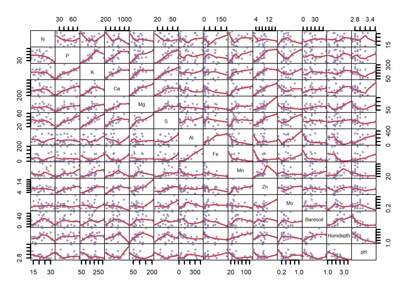
Figure 4.20: Pairwise correlations between environmental variables in the varechem dataset, where variable name is listed on the diagonal. Chemical measurements are denoted by their chemical element names. ‘Baresoil’ gives the estimated cover of bare soil, ‘Humdepth’ provides the thickness of the humus layer and ‘pH.’
We will use a formula interface to constrain the ordination. The shortcut “~.” indicates that we want to use all the variables in the environmental dataset, and you can see this in the output. We will of course remember to standardize and scale our data. The output shows the eigenvalues for both the constrained and unconstrained ordination axes. In particular, see how the variance (inertia) and rank (number of axes) are decomposed in constrained ordination.
stvarespec = as.data.frame(wisconsin(varespec))
scvarechem = as.data.frame(scale(varechem))
constr <- vegan::rda(stvarespec ~ ., data = scvarechem)
constr
Call: rda(formula = stvarespec ~ N + P + K + Ca + Mg + S + Al + Fe + Mn + Zn + Mo + Baresoil + Humdepth + pH, data =
scvarechem)
Inertia Proportion Rank
Total 0.05084 1.00000
Constrained 0.03612 0.71057 14
Unconstrained 0.01471 0.28943 9
Inertia is variance
Eigenvalues for constrained axes:
RDA1 RDA2 RDA3 RDA4 RDA5 RDA6 RDA7 RDA8 RDA9 RDA10 RDA11 RDA12 RDA13 RDA14
0.008120 0.005642 0.004808 0.003525 0.002956 0.002592 0.001953 0.001665 0.001265 0.001129 0.000964 0.000627 0.000507 0.000373
Eigenvalues for unconstrained axes:
PC1 PC2 PC3 PC4 PC5 PC6 PC7 PC8 PC9
0.004051 0.002184 0.002003 0.001853 0.001247 0.001101 0.001022 0.000722 0.000532 However, it is not recommended to perform a constrained ordination with all the environmental variables you happen to have: adding a large number of constraints means eventually you end up with solution similar to the unconstrained ordination. Moreover, collinearity in the explanatory variables will cause instability in the estimation of regression coefficients (see Fig 4.20).
Instead, let’s use the formula interface to select particular constraining variables
ord3 = vegan::rda(stvarespec ~ N + K + Al, data = scvarechem)
ord3
Call: rda(formula = stvarespec ~ N + K + Al, data = scvarechem)
Inertia Proportion Rank
Total 0.05084 1.00000
Constrained 0.01171 0.23041 3
Unconstrained 0.03913 0.76959 20
Inertia is variance
Eigenvalues for constrained axes:
RDA1 RDA2 RDA3
0.006722 0.003232 0.001761
Eigenvalues for unconstrained axes:
PC1 PC2 PC3 PC4 PC5 PC6 PC7 PC8
0.007246 0.004097 0.003737 0.003515 0.003305 0.002474 0.002369 0.001785
(Showing 8 of 20 unconstrained eigenvalues)Examine the output. How did we do? Unsurprisingly, we have not explained as much variance as the full model. In addition, the amount of variance (inertia) explained by the constrained axes is less than the unconstrained axes. Maybe we shouldn’t be using this analysis at all. Of course, some of the variables in the full model may or may not be important. We need a significance test to try and sort this out.
4.4.3 Signficance tests for constrained ordination
The vegan package provides permutation tests for the significance of constraints. The test mimics a standard ANOVA function, and the default test analyses all constraints simultaneously.
anova(ord3)Permutation test for rda under reduced model
Permutation: free
Number of permutations: 999
Model: rda(formula = stvarespec ~ N + K + Al, data = scvarechem)
Df Variance F Pr(>F)
Model 3 0.011714 1.996 0.001 ***
Residual 20 0.039125
---
Signif. codes: 0 '***' 0.001 '**' 0.01 '*' 0.05 '.' 0.1 ' ' 1So the results suggest that our model explains a significant amount of variation in the data. We can also perform significance tests for each variable:
anova(ord3, by = "term", permutations = 199)Permutation test for rda under reduced model
Terms added sequentially (first to last)
Permutation: free
Number of permutations: 199
Model: rda(formula = stvarespec ~ N + K + Al, data = scvarechem)
Df Variance F Pr(>F)
N 1 0.002922 1.4937 0.085 .
K 1 0.003120 1.5948 0.045 *
Al 1 0.005672 2.8994 0.005 **
Residual 20 0.039125
---
Signif. codes: 0 '***' 0.001 '**' 0.01 '*' 0.05 '.' 0.1 ' ' 1The analysis suggests that maybe we haven’t chosen the best set of predictors. For example, N does not explain a significant amount of variation. This test is sequential: the terms are analyzed in the order they happen to be in the model, so you may get different results depending on how the model is specified. See if you can detect this, by rearranging your model terms in the call to ordination.
NB It is also possible to analyze the significance of marginal effects (“Type III effects”) by specifying that option (by=‘mar’) or analyse the significance of each axis, again by specifying that option in the anova call (i.e.,by=‘axis’).
4.4.4 Forward Selection of explanatory variables
You may wonder if you have selected the correct variables! We can use the ordiR2step() function to perform forward selection (and backwards selection or both directions) on a null model. In automatic model building we usually need two extreme models: the smallest and the largest model considered. First we specify a full model with all the environmental variables, and then a minimal model with intercept only, where both are defined using a formula so that terms can be added or removed from the model. Then we allow an automated model selection function to move between these extremes, trying to minimize a metric of model fit, such as \(R^2\). We will then use ordiR2step() to find an optimal model based on both permutation and adjusted \(R^2\) values. If you switch the trace=FALSE option to trace=TRUE you can watch the function doing its work.
mfull <- vegan::rda(stvarespec ~ ., data = scvarechem)
m0 <- vegan::rda(stvarespec ~ 1, data = scvarechem)

optm <- ordiR2step(m0, scope = formula(mfull), trace = FALSE)
optm$anova
R2.adj Df AIC F Pr(>F)
+ Fe 0.063299 1 -71.156 2.5543 0.004 **
+ P 0.103626 1 -71.329 1.9898 0.008 **
+ Mn 0.136721 1 -71.402 1.8051 0.022 *
<All variables> 0.260356
---
Signif. codes: 0 '***' 0.001 '**' 0.01 '*' 0.05 '.' 0.1 ' ' 1Exercise 4 Examine the significance test. How does this automatically selected model differ from the full model and your manually selected version?
Next check the variance (i.e., inertia). If the variance explained by the constrained model is not much higher than your unconstrained variance, then it may be that the rda is not really needed. This certainly seems to be the case, but let’s press on regardless!
Call: rda(formula = stvarespec ~ Fe + P + Mn, data = scvarechem)

              Inertia Proportion Rank
Total         0.05084    1.00000
Constrained   0.01268    0.24932    3
Unconstrained 0.03816    0.75068   20
Inertia is variance

Eigenvalues for constrained axes:
    RDA1     RDA2     RDA3
0.006070 0.003607 0.002998

Eigenvalues for unconstrained axes:
     PC1      PC2      PC3      PC4      PC5      PC6      PC7      PC8
0.006435 0.004626 0.003763 0.003301 0.003204 0.002592 0.002003 0.001852
(Showing 8 of 20 unconstrained eigenvalues)
Contrary to what one sometimes reads, variables with high VIFs should generally not be manually removed before the application of a procedure of selection of variables. Indeed, two highly correlated variables that are both strong predictors of one or several of the response variables Y may both contribute significantly, in complementary manners, to the linear model of these response variables. A variable selection procedure is the appropriate way of determining if that is the case.
However, let’s see what happened with collinearity. VIFs can be computed in vegan after RDA or CCA. The algorithm in the vif.cca() function allows users to include factors in the RDA; the function will compute VIF after breaking down each factor into dummy variables. If X contains quantitative variables only, the vif.cca() function produces the same result as the normal calculation for quantitative variables.
vif.cca(mfull) N P K Ca Mg S Al Fe Mn Zn Mo Baresoil Humdepth pH
1.884049 6.184742 11.746873 9.825650 9.595203 18.460717 20.331905 8.849137 5.168278 7.755110 4.575108 2.213443 5.638807 6.910118 vif.cca(optm) Fe P Mn
1.259334 1.431022 1.738208 Some VIF values are above 10 or even 20 in the full model, so that a reduction of the number of explanatory variables is justified. The VIF values in the reduced model are quite low.
Finally, let’s examine the adjusted \(R^2\) of the full and selected models.
round(RsquareAdj(mfull)$adj.r.squared, 2)[1] 0.26round(RsquareAdj(optm)$adj.r.squared, 2)[1] 0.14The adjusted \(R^2\) for the reduced model is pretty bad, but so is the full model! It will definitely be easier to interpret the reduced model
Now! We are all set to produce some ordination plots
4.4.5 Triplots: Graphing a constrained ordination
If the constrained ordination is significant, we go on to display the results graphically. All ordination results of vegan can be displayed with a plot command. For a constrained ordination we will want a triplot, which has three different things plotted: the data objects, the response variables and the explanatory variables. For the varespec and varechem data these will be sites, species, and environmental predictors respectively.
Plotting an biplot or triplot is not as simple as it sounds, as I mentioned above, one can choose various scaling conventions that will dramatically change the appearance and interpretation of the plot. One of the editors of the vegan package, Gavin Simpson, has more to say about this here. Essentially, there can be no scaling (“none”), or either the data object (“site”) or characteristic (“species”) scores are scaled by eigenvalues, and the other set of scores is left unscaled, or both scores are scaled symmetrically by square root of eigenvalues (“symmetric”). The general advice is to use scaling for “sites” where you want a biplot focussed on the sites/samples and the (dis)similarity between them in terms of the species (or variables), and use scaling for “species” where you want to best represent the correlations between species (or variables). I’ve plotted the “site” and “species” types below (Fig. 4.21). Were you able to produce the same ordinations?
par(mfrow = c(1, 2))

# Triplots of the parsimonious RDA (scaling=1) Scaling 1
plot(optm, scaling = "sites", main = "Sites scaling (scaling=1)",
    correlation = TRUE)

# Triplots of the parsimonious RDA (scaling=2) Scaling 2
plot(optm, scaling = "species", main = "Species scaling (scaling=2)")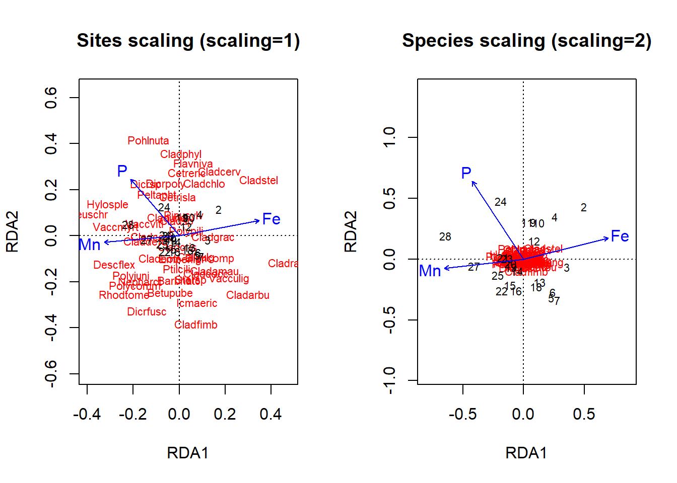
Figure 4.21: Triplots of an RDA ordination on the lichen data with either site or species scaling using a basic plot command
Its pretty hard to see what is going on in these basic plots, so I am going to take the time to produce more curated versions. I am going to select which species data I display, and the change the appearance and axis limits somewhat.
par(mfrow = c(1, 1))
sp.scores = scores(optm, display = "species", scaling = 1)
sp.scores = sp.scores[sp.scores[, 1] > abs(0.1) | sp.scores[,
    2] > abs(0.1), ]


plot(optm, scaling = 1, type = "n", main = "Sites scaling (scaling=1)",
    ylim = c(-0.2, 0.2), xlim = c(-0.3, 0.5))
arrows(x0 = 0, y0 = 0, sp.scores[, 1], sp.scores[, 2], length = 0.05)
text(sp.scores, row.names(sp.scores), col = 2, cex = 0.6, pos = 3)
text(optm, display = "bp", scaling = 1, cex = 0.8, lwd = 1.5,
    row.names(scores(optm, display = "bp")), col = 4)
text(optm, display = c("sites"), scaling = 1, cex = 1)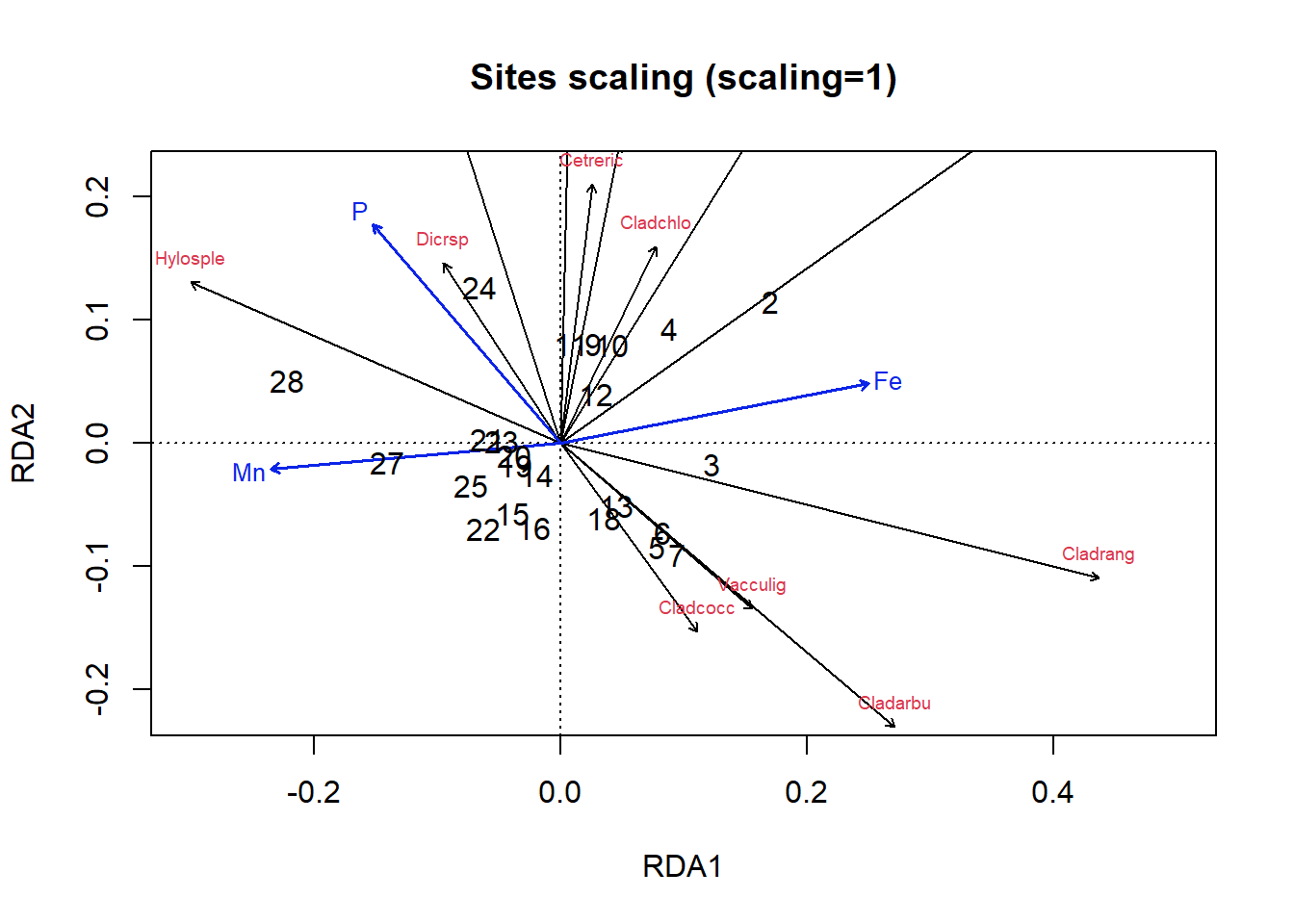
Figure 4.22: Triplot of an RDA ordination on the lichen data with site scaling
plot(optm, scaling = 2, type = "n", main = "Species scaling (scaling=2)",
    ylim = c(-0.4, 0.4))

arrows(x0 = 0, y0 = 0, sp.scores[, 1], sp.scores[, 2], length = 0.05)
text(sp.scores, row.names(sp.scores), col = 2, cex = 0.7, pos = 3)
text(optm, display = "bp", scaling = 2, cex = 0.8, lwd = 1.5,
    row.names(scores(optm, display = "bp")), col = 4)
text(optm, display = c("sites"), scaling = 2, cex = 1)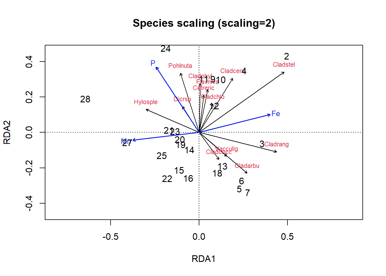
Figure 4.23: Triplot of an RDA ordination on the lichen data with species scaling
Okay, let’s figure out how to interpret these plots. In the site scaling option (Fig 4.22), dissimilarity distances between data objects are preserved. So, sites which are closer together on the ordination are more similar. In addition, the projection of a data object (site) onto the line of a response variable (species) at right angle approximates the position of the corresponding object along the corresponding variable. Angles between lines of response variables (species) and lines of explanatory variables are a two-dimensional approximation of correlations. But other angles between lines are meaningless (e.g., angles between response vectors don’t mean anything).
In the species scaling plot (Fig 4.23), distances are now meaningless, and as a result the length of vectors are not important. However, the cosine of the angle between lines of the response variables or of explanatory variables is approximately equal to the correlation between the corresponding variables.
So, looking at our first plot, sites 2, 28 and perhaps 3 seem quite different from others. For site 3, this is perhaps because of the abundance of Cladrang, which might be responding to iron levels (Fe). Site 28 might differ because of higher abundances of Hylosple, which may be related to Mn. Notice how we can see on the species scaling plot the strong correlation between P and species Dicrsp, which is somewhat different on the site scaling plot.
4.4.5.1 What next?
In this short introduction we have not demonstrated how to complete and interpret other forms of constrained ordination such as Canonical Correspondence Analysis, partial RDA (which would allow you to control for well-known linear effects), or analysis designed for qualiticative variables, such as Multiple Correspondence Analysis (MCA). There are functions in the vegan and FactoMineR packages to do many of these things.
4.4.6 Feedback
We value your input! Please take the time to let us know how we might improve these materials. Survey
4.5 References
Borcard, D., Gillet, F., & Legendre, P. (2011). Numerical ecology with R. New York: springer.
Goodall, D. W. (1954). Objective methods for the classification of vegetation. III. An essay in the use of factor analysis. Australian Journal of Botany, 2(3), 304–324. https://doi.org/10.1071/bt9540304
Greenacre, M. (2017). Ordination with any dissimilarity measure: A weighted Euclidean solution. Ecology, 98(9), 2293–2300. https://doi.org/10.1002/ecy.1937
Hotelling, H. (1933). Analysis of a complex of statistical variables into principal components. Journal of Educational Psychology, 24(6), 417–441. https://doi.org/10.1037/h0071325
Legendre, P., & Anderson, M. J. (1999). Distance-Based Redundancy Analysis: Testing Multispecies Responses in Multifactorial Ecological Experiments. Ecological Monographs, 69(1), 1–24. https://doi.org/10.1890/0012-9615(1999)069[0001:DBRATM]2.0.CO;2
Legendre, P., & De Cáceres, M. (2013). Beta diversity as the variance of community data: Dissimilarity coefficients and partitioning. Ecology Letters, 16(8), 951–963. https://doi.org/10.1111/ele.12141
Legendre, P., & Gallagher, E. D. (2001). Ecologically meaningful transformations for ordination of species data. Oecologia, 129(2), 271–280. https://doi.org/10.1007/s004420100716
Legendre, P., & Legendre, L. (2012). Numerical ecology. Elsevier.
Pearson, K. (1901). LIII. On lines and planes of closest fit to systems of points in space. The London, Edinburgh, and Dublin Philosophical Magazine and Journal of Science, 2(11), 559–572. https://doi.org/10.1080/14786440109462720
Perkins, M. J., McDonald, R. A., Veen, F. J. F. van, Kelly, S. D., Rees, G., & Bearhop, S. (2014). Application of Nitrogen and Carbon Stable Isotopes (δ15N and δ13C) to Quantify Food Chain Length and Trophic Structure. PLOS ONE, 9(3), e93281. https://doi.org/10.1371/journal.pone.0093281
Pielou, E. C. (1984). The interpretation of ecological data: A primer on classification and ordination. John Wiley & Sons.
Rao, C. R. (1964). The Use and Interpretation of Principal Component Analysis in Applied Research. Sankhyā: The Indian Journal of Statistics, Series A (1961-2002), 26(4), 329–358. https://www.jstor.org/stable/25049339
Ter Braak, C. J. (1988). CANOCO-a FORTRAN program for canonical community ordination by partial detrended canonical correspondence analysis, principal components analysis and redundancy analysis (version 2.1). MLV.
Watson, N. H. F., & Carpenter, G. F. (1974). Seasonal Abundance of Crustacean Zooplankton and Net Plankton Biomass of Lakes Huron, Erie, and Ontario. Journal of the Fisheries Research Board of Canada, 31(3), 309–317. https://doi.org/10.1139/f74-050
van den Wollenberg, A. L. (1977). Redundancy analysis an alternative for canonical correlation analysis. Psychometrika, 42(2), 207–219. https://doi.org/10.1007/BF02294050
4.6 Answer Key
Exercise 1. All we need to do is to take the square root of the sum of the squared differences to obtain the Euclidean distance as
round(sqrt(eu[11, 4]), 2)[1] 61.6Exercise 2. We use the kmeans() function with 4 clusters to find groups in the isotope data. We can then save the assigned clusters to our dataframe and plot in a similar way
# select 4 clusters and run the kmeans function
kclust = kmeans(niso[, c("C", "N")], 4)
niso$kclust = kclust$cluster

# superimpose the saved clusters on our plotted isotope
# data
plot(iso$N ~ iso$C, col = as.numeric(as.factor(niso$clust)),
    xlim = c(-35, 0), pch = as.numeric(as.factor(niso$Species)),
    xlab = expression(paste(delta, "13C")), ylab = expression(paste(delta,
        "15N")))

legend("topright", legend = unique(as.factor(niso$kclust)), pch = 1,
    col = as.numeric(unique(as.factor(niso$kclust))), bty = "n",
    title = "kcluster")

legend("bottomright", legend = as.character(unique(as.factor(niso$Species))),
    pch = as.numeric(unique(as.factor(niso$Species))), bty = "n",
    title = "Species")
Figure 4.24: K means clustering on Perkins et al (2014) data for 4 clusters
It looks like kmeans has the same problem with distinguishing C3 plant-based foodwebs. But we still get three groups that roughly map onto our information about the data.
Exercise 3. Interpretation of the PCoA and the nMDS oridination plots of the varespec data is straightforward: sites ordinated closer to one another are more similar than those ordinated further away. We can interpret the nMDS, remembering that the first ordination axis corresponds to the most variance in our data and so on. Looking at the plot, it seems that sites 28, 27 and possibly 21 are pretty similar to each other, and different from other sites, possibly due to the species aligned in that direction on the x-axis such as Betupube. Sites 2 and 5 might be rather different from other sites. This might be due species like Cladcerv for site 2. Some sites (e.g., 6, 13, 20) are not well distinguished by the ordination. Others like 9, 10, 11, and 12 might group together.
PCoA gives us broadly the same information and also suggests that sites 21, 28, 27 are similar to each other and different from other sites. This visualization also agrees that sites 2 and 5 might be different from the others, and that 9, 10, 11, and 12 might be similar.
Exercise 4. The automatically selected rda model of the lichen data includes three significant predictors: Fe, P and Mn, while the full model has 14 potential predictors. Our manually selected model of three predictors N, K and Al don’t even appear in the automatically selected model.